Unix Time with Matplotlib
In this Matplotlib tutorial video, we're going to cover how to handle the conversion of unix time stamps to then plot date stamps in your graph. With the Yahoo Finance API, you will notice that if you use large time frames, like 1y for one year, you will get those date stamps we've been working with, but, if you use something like 10d for 10 days, you will instead get timestamps that are unix time.
Unix time is the number of seconds after Jan 1st 1970, and it represents a normalized method for time across programs. That said, Matplotlib doesn't want unix time stamps. Here's what you can do to handle unix time with Matplotlib:
import matplotlib.pyplot as plt
import numpy as np
import urllib
import datetime as dt
import matplotlib.dates as mdates

def bytespdate2num(fmt, encoding='utf-8'):
    strconverter = mdates.strpdate2num(fmt)
    def bytesconverter(b):
        s = b.decode(encoding)
        return strconverter(s)
    return bytesconverter


def graph_data(stock):

    fig = plt.figure()
    ax1 = plt.subplot2grid((1,1), (0,0))

    # Unfortunately, Yahoo's API is no longer available
    # feel free to adapt the code to another source, or use this drop-in replacement.
    stock_price_url = 'https://pythonprogramming.net/yahoo_finance_replacement'
    source_code = urllib.request.urlopen(stock_price_url).read().decode()
    stock_data = []
    split_source = source_code.split('\n')
    for line in split_source[1:]:
        split_line = line.split(',')
        if len(split_line) == 7:
            if 'values' not in line and 'labels' not in line:
                stock_data.append(line)

    date, closep, highp, lowp, openp, adj_closep, volume = np.loadtxt(stock_data,
                                                          delimiter=',',
                                                          unpack=True)
    dateconv = np.vectorize(dt.datetime.fromtimestamp)
    date = dateconv(date)

##    date, closep, highp, lowp, openp, adj_closep, volume = np.loadtxt(stock_data,
##                                                          delimiter=',',
##                                                          unpack=True,
##                                                          converters={0: bytespdate2num('%Y-%m-%d')})

    ax1.plot_date(date, closep,'-', label='Price')
    for label in ax1.xaxis.get_ticklabels():
        label.set_rotation(45)
    ax1.grid(True)#, color='g', linestyle='-', linewidth=5)

    plt.xlabel('Date')
    plt.ylabel('Price')
    plt.title('Interesting Graph\nCheck it out')
    plt.legend()
    plt.subplots_adjust(left=0.09, bottom=0.20, right=0.94, top=0.90, wspace=0.2, hspace=0)
    plt.show()


graph_data('TSLA')
So, here, what we've done is write handling for unix time, and commented out our previous code, since we're saving it for later. The main difference here is:
    dateconv = np.vectorize(dt.datetime.fromtimestamp)
    date = dateconv(date)
Here, we're converting the timestamp to a datestamp, then converting it to the time that Matplotlib wants.
Now, for some reason, the unix time for me came with another row of data that contained 6 elements, and it contained the term "label," so, in our for loop where we are parsing the data, we add one more check for you to take note of:
    for line in split_source[1:]:
        split_line = line.split(',')
        if len(split_line) == 7:
            if 'values' not in line and 'labels' not in line:
                stock_data.append(line)
With that, you should get a graph like:
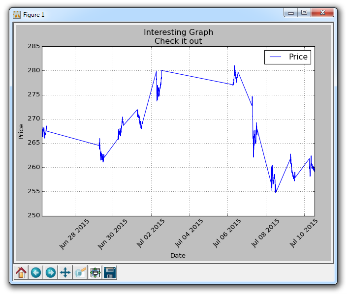
The reason for all the flat lines here is that the market is closed. With this shorter-term data, we are getting intra-day data. So there are a lot of plots while trading is open, then nothing for market close, then a bunch, then nothing.
-
Introduction to Matplotlib and basic line
-
Legends, Titles, and Labels with Matplotlib
-
Bar Charts and Histograms with Matplotlib
-
Scatter Plots with Matplotlib
-
Stack Plots with Matplotlib
-
Pie Charts with Matplotlib
-
Loading Data from Files for Matplotlib
-
Data from the Internet for Matplotlib
-
Converting date stamps for Matplotlib
-
Basic customization with Matplotlib
-
Unix Time with Matplotlib
-
Colors and Fills with Matplotlib
-
Spines and Horizontal Lines with Matplotlib
-
Candlestick OHLC graphs with Matplotlib
-
Styles with Matplotlib
-
Live Graphs with Matplotlib
-
Annotations and Text with Matplotlib
-
Annotating Last Price Stock Chart with Matplotlib
-
Subplots with Matplotlib
-
Implementing Subplots to our Chart with Matplotlib
-
More indicator data with Matplotlib
-
Custom fills, pruning, and cleaning with Matplotlib
-
Share X Axis, sharex, with Matplotlib
-
Multi Y Axis with twinx Matplotlib
-
Custom Legends with Matplotlib
-
Basemap Geographic Plotting with Matplotlib
-
Basemap Customization with Matplotlib
-
Plotting Coordinates in Basemap with Matplotlib
-
3D graphs with Matplotlib
-
3D Scatter Plot with Matplotlib
-
3D Bar Chart with Matplotlib
-
Conclusion with Matplotlib
