Colors and Fills with Matplotlib
In this tutorial, we're going to cover some more customization, along the lines of colors and fills.
The first change we're going to make here is changing plt.title to the stock var.
plt.title(stock)
Now, let's cover how we can change label colors. We can do this by modifying our axis object:
    ax1.xaxis.label.set_color('c')
    ax1.yaxis.label.set_color('r')
If we run this, we would see the labels, as in the words, have changed color.
Next, we can specify specific numbers for our axis to show, rather than automated choices like so:
ax1.set_yticks([0,25,50,75])
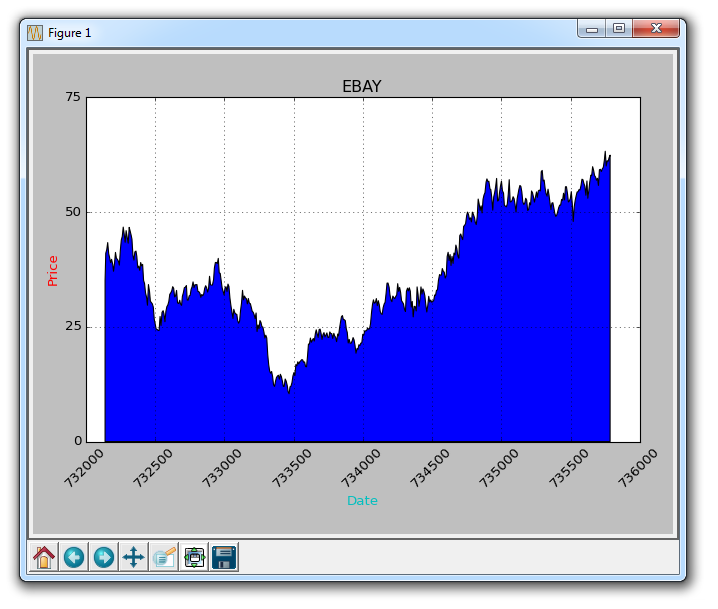
Next, I would like to cover fills. What fills does is it will fill between the variable and a number you can choose. For example, we can do something like:
ax1.fill_between(date, 0, closep)
So at this point, our code would be:
import matplotlib.pyplot as plt
import numpy as np
import urllib
import datetime as dt
import matplotlib.dates as mdates

def bytespdate2num(fmt, encoding='utf-8'):
    strconverter = mdates.strpdate2num(fmt)
    def bytesconverter(b):
        s = b.decode(encoding)
        return strconverter(s)
    return bytesconverter


def graph_data(stock):

    fig = plt.figure()
    ax1 = plt.subplot2grid((1,1), (0,0))

    # Unfortunately, Yahoo's API is no longer available
    # feel free to adapt the code to another source, or use this drop-in replacement.
    stock_price_url = 'https://pythonprogramming.net/yahoo_finance_replacement'
    source_code = urllib.request.urlopen(stock_price_url).read().decode()
    stock_data = []
    split_source = source_code.split('\n')
    for line in split_source[1:]:
        split_line = line.split(',')
        if len(split_line) == 7:
            if 'values' not in line and 'labels' not in line:
                stock_data.append(line)


    date, closep, highp, lowp, openp, adj_closep, volume = np.loadtxt(stock_data,
                                                          delimiter=',',
                                                          unpack=True,
                                                          converters={0: bytespdate2num('%Y-%m-%d')})

    ax1.fill_between(date, 0, closep)

    for label in ax1.xaxis.get_ticklabels():
        label.set_rotation(45)
    ax1.grid(True)#, color='g', linestyle='-', linewidth=5)
    ax1.xaxis.label.set_color('c')
    ax1.yaxis.label.set_color('r')
    ax1.set_yticks([0,25,50,75])

    plt.xlabel('Date')
    plt.ylabel('Price')
    plt.title(stock)
    plt.legend()
    plt.subplots_adjust(left=0.09, bottom=0.20, right=0.94, top=0.90, wspace=0.2, hspace=0)
    plt.show()


graph_data('EBAY')
The result:
One problem with fills, is that we might wind up covering things up. We can solve this with an alpha:
ax1.fill_between(date, 0, closep)
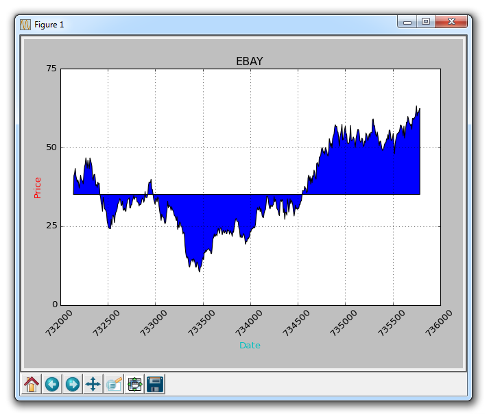
Now, let's talk about conditional fills. Let's assume the start the graph is where we started buying into eBay. From here, if the price goes below this price, we can fill up to the original price and then if it goes above, we can fill below. We can do this by:
ax1.fill_between(date, closep[0], closep)
Giving us:
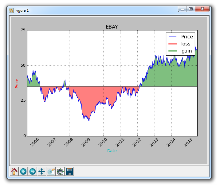
What if we wanted to illustrate gains / losses with maybe a red and green fill, where green fill is used for a rise and red fill is used for a fall under our original price? No problem! We can add a where parameter, like so:
ax1.fill_between(date, closep, closep[0],where=(closep > closep[0]), facecolor='g', alpha=0.5)
Here, we are filling between the current price, and the original price, where the current price is above the original first price. We give it a face color of green, since this is a rise, and we apply a slight alpha.
We still cannot apply a label to polygon data like fills, but we can implement empty lines like before, so we can do:
    ax1.plot([],[],linewidth=5, label='loss', color='r',alpha=0.5)
    ax1.plot([],[],linewidth=5, label='gain', color='g',alpha=0.5)

    ax1.fill_between(date, closep, closep[0],where=(closep > closep[0]), facecolor='g', alpha=0.5)
    ax1.fill_between(date, closep, closep[0],where=(closep < closep[0]), facecolor='r', alpha=0.5)
This gives us our fills, and a couple empty lines to handle for the labels that we want to show up in the legend. At this point, the full code is:
import matplotlib.pyplot as plt
import numpy as np
import urllib
import datetime as dt
import matplotlib.dates as mdates

def bytespdate2num(fmt, encoding='utf-8'):
    strconverter = mdates.strpdate2num(fmt)
    def bytesconverter(b):
        s = b.decode(encoding)
        return strconverter(s)
    return bytesconverter


def graph_data(stock):

    fig = plt.figure()
    ax1 = plt.subplot2grid((1,1), (0,0))

    # Unfortunately, Yahoo's API is no longer available
    # feel free to adapt the code to another source, or use this drop-in replacement.
    stock_price_url = 'https://pythonprogramming.net/yahoo_finance_replacement'
    source_code = urllib.request.urlopen(stock_price_url).read().decode()
    stock_data = []
    split_source = source_code.split('\n')
    for line in split_source[1:]:
        split_line = line.split(',')
        if len(split_line) == 7:
            if 'values' not in line and 'labels' not in line:
                stock_data.append(line)

    date, closep, highp, lowp, openp, adj_closep, volume = np.loadtxt(stock_data,
                                                          delimiter=',',
                                                          unpack=True,
                                                          converters={0: bytespdate2num('%Y-%m-%d')})

    ax1.plot_date(date, closep,'-', label='Price')

    ax1.plot([],[],linewidth=5, label='loss', color='r',alpha=0.5)
    ax1.plot([],[],linewidth=5, label='gain', color='g',alpha=0.5)

    ax1.fill_between(date, closep, closep[0],where=(closep > closep[0]), facecolor='g', alpha=0.5)
    ax1.fill_between(date, closep, closep[0],where=(closep < closep[0]), facecolor='r', alpha=0.5)

    for label in ax1.xaxis.get_ticklabels():
        label.set_rotation(45)
    ax1.grid(True)#, color='g', linestyle='-', linewidth=5)
    ax1.xaxis.label.set_color('c')
    ax1.yaxis.label.set_color('r')
    ax1.set_yticks([0,25,50,75])

    plt.xlabel('Date')
    plt.ylabel('Price')
    plt.title(stock)
    plt.legend()
    plt.subplots_adjust(left=0.09, bottom=0.20, right=0.94, top=0.90, wspace=0.2, hspace=0)
    plt.show()


graph_data('EBAY')
Now our result is:
There exists 2 quiz/question(s) for this tutorial. for access to these, video downloads, and no ads.
-
Introduction to Matplotlib and basic line
-
Legends, Titles, and Labels with Matplotlib
-
Bar Charts and Histograms with Matplotlib
-
Scatter Plots with Matplotlib
-
Stack Plots with Matplotlib
-
Pie Charts with Matplotlib
-
Loading Data from Files for Matplotlib
-
Data from the Internet for Matplotlib
-
Converting date stamps for Matplotlib
-
Basic customization with Matplotlib
-
Unix Time with Matplotlib
-
Colors and Fills with Matplotlib
-
Spines and Horizontal Lines with Matplotlib
-
Candlestick OHLC graphs with Matplotlib
-
Styles with Matplotlib
-
Live Graphs with Matplotlib
-
Annotations and Text with Matplotlib
-
Annotating Last Price Stock Chart with Matplotlib
-
Subplots with Matplotlib
-
Implementing Subplots to our Chart with Matplotlib
-
More indicator data with Matplotlib
-
Custom fills, pruning, and cleaning with Matplotlib
-
Share X Axis, sharex, with Matplotlib
-
Multi Y Axis with twinx Matplotlib
-
Custom Legends with Matplotlib
-
Basemap Geographic Plotting with Matplotlib
-
Basemap Customization with Matplotlib
-
Plotting Coordinates in Basemap with Matplotlib
-
3D graphs with Matplotlib
-
3D Scatter Plot with Matplotlib
-
3D Bar Chart with Matplotlib
-
Conclusion with Matplotlib
