Spines and Horizontal Lines with Matplotlib
Welcome to another customization tutorial, where we discuss spines and horizontal lines with Matplotlib. Something you might want to do from time to time is to change the color of a spine, or maybe even remove one all together.
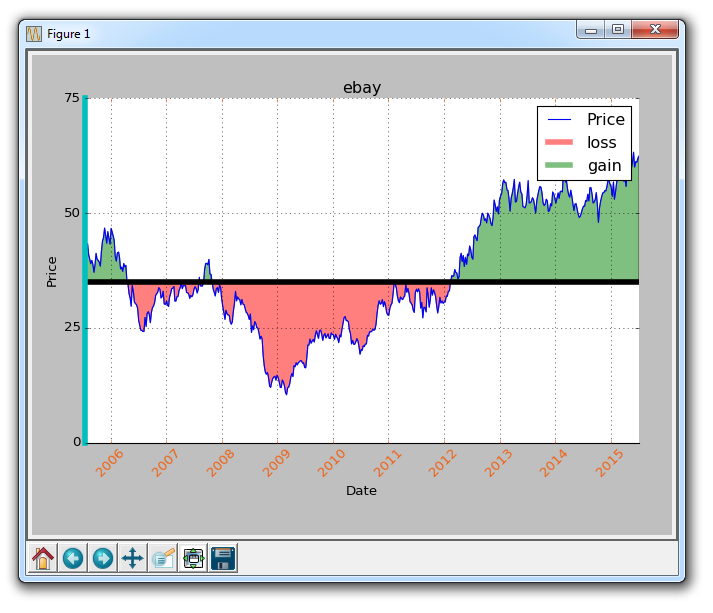
A spine to a graph is basically the edge of the graph, where we have the ticks and such. In order to change the color of a spine, you can do something like:
ax1.spines['left'].set_color('c')
Here, we're referencing our dictionary of spines, saying we want to adjust the left spine, and then we use the set_color method to set the color to 'c,' which is cyan.
What if we wanted to remove spines all together? We can do that like:
    ax1.spines['right'].set_visible(False)
    ax1.spines['top'].set_visible(False)
This does very similar code, and removes the spine to the right and the top spine.
It's hard to tell that we modified the color of the left spine, so let's make that really obvious, by modifying the line width:
ax1.spines['left'].set_linewidth(5)
Now that makes the left spine very thick and obviously cyan. Finally, what if we want to modify the tick parameters? Say instead of black dates, we want some orange-ish colored dates? No problem!
ax1.tick_params(axis='x', colors='#f06215')
Now our dates are orange! Next, let's cover how we might go about drawing a horizontal line. You could of course just plot a new set of data that you create to be a horizontal line, but you don't need to do this. You can do:
ax1.axhline(closep[0], color='k', linewidth=5)
So, at this point, our entire code is:
import matplotlib.pyplot as plt
import numpy as np
import urllib
import datetime as dt
import matplotlib.dates as mdates

def bytespdate2num(fmt, encoding='utf-8'):
    strconverter = mdates.strpdate2num(fmt)
    def bytesconverter(b):
        s = b.decode(encoding)
        return strconverter(s)
    return bytesconverter


def graph_data(stock):

    fig = plt.figure()
    ax1 = plt.subplot2grid((1,1), (0,0))

    # Unfortunately, Yahoo's API is no longer available
    # feel free to adapt the code to another source, or use this drop-in replacement.
    stock_price_url = 'https://pythonprogramming.net/yahoo_finance_replacement'
    source_code = urllib.request.urlopen(stock_price_url).read().decode()
    stock_data = []
    split_source = source_code.split('\n')
    for line in split_source[1:]:
        split_line = line.split(',')
        if len(split_line) == 7:
            if 'values' not in line and 'labels' not in line:
                stock_data.append(line)


    date, closep, highp, lowp, openp, adj_closep, volume = np.loadtxt(stock_data,
                                                          delimiter=',',
                                                          unpack=True,
                                                          converters={0: bytespdate2num('%Y-%m-%d')})

    ax1.plot_date(date, closep,'-', label='Price')
    ax1.plot([],[],linewidth=5, label='loss', color='r',alpha=0.5)
    ax1.plot([],[],linewidth=5, label='gain', color='g',alpha=0.5)
    ax1.axhline(closep[0], color='k', linewidth=5)
    ax1.fill_between(date, closep, closep[0],where=(closep > closep[0]), facecolor='g', alpha=0.5)
    ax1.fill_between(date, closep, closep[0],where=(closep < closep[0]), facecolor='r', alpha=0.5)

    for label in ax1.xaxis.get_ticklabels():
        label.set_rotation(45)
    ax1.grid(True)
    #ax1.xaxis.label.set_color('c')
    #ax1.yaxis.label.set_color('r')
    ax1.set_yticks([0,25,50,75])

    ax1.spines['left'].set_color('c')
    ax1.spines['right'].set_visible(False)
    ax1.spines['top'].set_visible(False)
    ax1.spines['left'].set_linewidth(5)

    ax1.tick_params(axis='x', colors='#f06215')


    plt.xlabel('Date')
    plt.ylabel('Price')
    plt.title(stock)
    plt.legend()
    plt.subplots_adjust(left=0.09, bottom=0.20, right=0.94, top=0.90, wspace=0.2, hspace=0)
    plt.show()


graph_data('ebay')
The result:
-
Introduction to Matplotlib and basic line
-
Legends, Titles, and Labels with Matplotlib
-
Bar Charts and Histograms with Matplotlib
-
Scatter Plots with Matplotlib
-
Stack Plots with Matplotlib
-
Pie Charts with Matplotlib
-
Loading Data from Files for Matplotlib
-
Data from the Internet for Matplotlib
-
Converting date stamps for Matplotlib
-
Basic customization with Matplotlib
-
Unix Time with Matplotlib
-
Colors and Fills with Matplotlib
-
Spines and Horizontal Lines with Matplotlib
-
Candlestick OHLC graphs with Matplotlib
-
Styles with Matplotlib
-
Live Graphs with Matplotlib
-
Annotations and Text with Matplotlib
-
Annotating Last Price Stock Chart with Matplotlib
-
Subplots with Matplotlib
-
Implementing Subplots to our Chart with Matplotlib
-
More indicator data with Matplotlib
-
Custom fills, pruning, and cleaning with Matplotlib
-
Share X Axis, sharex, with Matplotlib
-
Multi Y Axis with twinx Matplotlib
-
Custom Legends with Matplotlib
-
Basemap Geographic Plotting with Matplotlib
-
Basemap Customization with Matplotlib
-
Plotting Coordinates in Basemap with Matplotlib
-
3D graphs with Matplotlib
-
3D Scatter Plot with Matplotlib
-
3D Bar Chart with Matplotlib
-
Conclusion with Matplotlib
