Custom fills, pruning, and cleaning with Matplotlib
Welcome to another Matplotlib tutorial! In this tutorial, we're going to clean our chart a bit, and then do a few more customizations.
Our current code is:
import matplotlib.pyplot as plt
import matplotlib.dates as mdates
import matplotlib.ticker as mticker
from matplotlib.finance import candlestick_ohlc
from matplotlib import style

import numpy as np
import urllib
import datetime as dt

style.use('fivethirtyeight')
print(plt.style.available)

print(plt.__file__)

MA1 = 10
MA2 = 30

def moving_average(values, window):
    weights = np.repeat(1.0, window)/window
    smas = np.convolve(values, weights, 'valid')
    return smas

def high_minus_low(highs, lows):
    return highs-lows


def bytespdate2num(fmt, encoding='utf-8'):
    strconverter = mdates.strpdate2num(fmt)
    def bytesconverter(b):
        s = b.decode(encoding)
        return strconverter(s)
    return bytesconverter


def graph_data(stock):

    fig = plt.figure()
    ax1 = plt.subplot2grid((6,1), (0,0), rowspan=1, colspan=1)
    plt.title(stock)
    ax2 = plt.subplot2grid((6,1), (1,0), rowspan=4, colspan=1)
    plt.xlabel('Date')
    plt.ylabel('Price')
    ax3 = plt.subplot2grid((6,1), (5,0), rowspan=1, colspan=1)


    stock_price_url = 'http://chartapi.finance.yahoo.com/instrument/1.0/'+stock+'/chartdata;type=quote;range=1y/csv'
    source_code = urllib.request.urlopen(stock_price_url).read().decode()
    stock_data = []
    split_source = source_code.split('\n')
    for line in split_source:
        split_line = line.split(',')
        if len(split_line) == 6:
            if 'values' not in line and 'labels' not in line:
                stock_data.append(line)


    date, closep, highp, lowp, openp, volume = np.loadtxt(stock_data,
                                                          delimiter=',',
                                                          unpack=True,
                                                          converters={0: bytespdate2num('%Y%m%d')})

    x = 0
    y = len(date)
    ohlc = []

    while x < y:
        append_me = date[x], openp[x], highp[x], lowp[x], closep[x], volume[x]
        ohlc.append(append_me)
        x+=1

    ma1 = moving_average(closep,MA1)
    ma2 = moving_average(closep,MA2)
    start = len(date[MA2-1:])

    h_l = list(map(high_minus_low, highp, lowp))

    ax1.plot_date(date,h_l,'-')


    candlestick_ohlc(ax2, ohlc, width=0.4, colorup='#77d879', colordown='#db3f3f')

    for label in ax2.xaxis.get_ticklabels():
        label.set_rotation(45)

    ax2.xaxis.set_major_formatter(mdates.DateFormatter('%Y-%m-%d'))
    ax2.xaxis.set_major_locator(mticker.MaxNLocator(10))
    ax2.grid(True)

    bbox_props = dict(boxstyle='round',fc='w', ec='k',lw=1)

    ax2.annotate(str(closep[-1]), (date[-1], closep[-1]),
                 xytext = (date[-1]+4, closep[-1]), bbox=bbox_props)


##    # Annotation example with arrow
##    ax2.annotate('Bad News!',(date[11],highp[11]),
##                 xytext=(0.8, 0.9), textcoords='axes fraction',
##                 arrowprops = dict(facecolor='grey',color='grey'))
##
##
##    # Font dict example
##    font_dict = {'family':'serif',
##                 'color':'darkred',
##                 'size':15}
##    # Hard coded text
##    ax2.text(date[10], closep[1],'Text Example', fontdict=font_dict)


    ax3.plot(date[-start:], ma1[-start:])
    ax3.plot(date[-start:], ma2[-start:])


    plt.subplots_adjust(left=0.11, bottom=0.24, right=0.90, top=0.90, wspace=0.2, hspace=0)
    plt.show()


graph_data('EBAY')
Now I think it would be a cool idea to add a custom fill to our moving averages. Moving averages are generally used to illustrate trends with prices. The idea is that you can have a fast moving average and a slow one. Generally, moving averages are used to "smooth" price. They will always "lag" price a bit, but the idea is to have varying speeds. The larger the moving average, the "slower" it is. So the idea is that, if the "faster" moving average crosses above the "slower" one, that price is trending up, and this is a good thing. If the fast MA crosses below the slow MA then this is a down trend and usually seen as bad. My idea is to fill between the fast and slow MA when trend is "up" a green color, and then do red when it is down. Here's how:
    ax3.fill_between(date[-start:], ma2[-start:], ma1[-start:],
                     where=(ma1[-start:] < ma2[-start:]),
                     facecolor='r', edgecolor='r', alpha=0.5)

    ax3.fill_between(date[-start:], ma2[-start:], ma1[-start:],
                     where=(ma1[-start:] > ma2[-start:]),
                     facecolor='g', edgecolor='g', alpha=0.5)
Next, we have some date issues, which we can resolve:
    ax3.xaxis.set_major_formatter(mdates.DateFormatter('%Y-%m-%d'))
    ax3.xaxis.set_major_locator(mticker.MaxNLocator(10))

    for label in ax3.xaxis.get_ticklabels():
        label.set_rotation(45)

    plt.setp(ax1.get_xticklabels(), visible=False)
    plt.setp(ax2.get_xticklabels(), visible=False)
Here, we're cut and pasting the ax2 date formatting, and then we're setting x tick labels to false to make them go away!
We can also give custom labels to each axis by doing the following at the axis definitions:
    fig = plt.figure()
    ax1 = plt.subplot2grid((6,1), (0,0), rowspan=1, colspan=1)
    plt.title(stock)
    ax2 = plt.subplot2grid((6,1), (1,0), rowspan=4, colspan=1)
    plt.xlabel('Date')
    plt.ylabel('Price')
    ax3 = plt.subplot2grid((6,1), (5,0), rowspan=1, colspan=1)
Next, we can see we have a bit too many y ticks with numbers, running over eachother often. We also see the ticks are overlapping between axis too! We can handle for this by doing:
ax1.yaxis.set_major_locator(mticker.MaxNLocator(nbins=5, prune='lower'))
So, what is happening here is we are modifying our y axis object by first setting the nbins to 5. This means the most labels that we will show is 5. Then we can also "prune" the labels, so, in our case, we prune the lower label. This makes it disappear, so now there wont be any text overlap. We still might want to prune the top label of ax2, but here's what we're looking at so far and the source code:
Current Source:
import matplotlib.pyplot as plt
import matplotlib.dates as mdates
import matplotlib.ticker as mticker
from matplotlib.finance import candlestick_ohlc
from matplotlib import style

import numpy as np
import urllib
import datetime as dt

style.use('fivethirtyeight')
print(plt.style.available)

print(plt.__file__)

MA1 = 10
MA2 = 30

def moving_average(values, window):
    weights = np.repeat(1.0, window)/window
    smas = np.convolve(values, weights, 'valid')
    return smas

def high_minus_low(highs, lows):
    return highs-lows


def bytespdate2num(fmt, encoding='utf-8'):
    strconverter = mdates.strpdate2num(fmt)
    def bytesconverter(b):
        s = b.decode(encoding)
        return strconverter(s)
    return bytesconverter


def graph_data(stock):

    fig = plt.figure()
    ax1 = plt.subplot2grid((6,1), (0,0), rowspan=1, colspan=1)
    plt.title(stock)
    plt.ylabel('H-L')
    ax2 = plt.subplot2grid((6,1), (1,0), rowspan=4, colspan=1)
    plt.ylabel('Price')
    ax3 = plt.subplot2grid((6,1), (5,0), rowspan=1, colspan=1)
    plt.ylabel('MAvgs')


    stock_price_url = 'http://chartapi.finance.yahoo.com/instrument/1.0/'+stock+'/chartdata;type=quote;range=1y/csv'
    source_code = urllib.request.urlopen(stock_price_url).read().decode()
    stock_data = []
    split_source = source_code.split('\n')
    for line in split_source:
        split_line = line.split(',')
        if len(split_line) == 6:
            if 'values' not in line and 'labels' not in line:
                stock_data.append(line)


    date, closep, highp, lowp, openp, volume = np.loadtxt(stock_data,
                                                          delimiter=',',
                                                          unpack=True,
                                                          converters={0: bytespdate2num('%Y%m%d')})

    x = 0
    y = len(date)
    ohlc = []

    while x < y:
        append_me = date[x], openp[x], highp[x], lowp[x], closep[x], volume[x]
        ohlc.append(append_me)
        x+=1

    ma1 = moving_average(closep,MA1)
    ma2 = moving_average(closep,MA2)
    start = len(date[MA2-1:])

    h_l = list(map(high_minus_low, highp, lowp))


    ax1.plot_date(date,h_l,'-')
    ax1.yaxis.set_major_locator(mticker.MaxNLocator(nbins=5, prune='lower'))


    candlestick_ohlc(ax2, ohlc, width=0.4, colorup='#77d879', colordown='#db3f3f')


    ax2.grid(True)

    bbox_props = dict(boxstyle='round',fc='w', ec='k',lw=1)

    ax2.annotate(str(closep[-1]), (date[-1], closep[-1]),
                 xytext = (date[-1]+4, closep[-1]), bbox=bbox_props)


##    # Annotation example with arrow
##    ax2.annotate('Bad News!',(date[11],highp[11]),
##                 xytext=(0.8, 0.9), textcoords='axes fraction',
##                 arrowprops = dict(facecolor='grey',color='grey'))
##
##
##    # Font dict example
##    font_dict = {'family':'serif',
##                 'color':'darkred',
##                 'size':15}
##    # Hard coded text
##    ax2.text(date[10], closep[1],'Text Example', fontdict=font_dict)


    ax3.plot(date[-start:], ma1[-start:], linewidth=1)
    ax3.plot(date[-start:], ma2[-start:], linewidth=1)

    ax3.fill_between(date[-start:], ma2[-start:], ma1[-start:],
                     where=(ma1[-start:] < ma2[-start:]),
                     facecolor='r', edgecolor='r', alpha=0.5)

    ax3.fill_between(date[-start:], ma2[-start:], ma1[-start:],
                     where=(ma1[-start:] > ma2[-start:]),
                     facecolor='g', edgecolor='g', alpha=0.5)

    ax3.xaxis.set_major_formatter(mdates.DateFormatter('%Y-%m-%d'))
    ax3.xaxis.set_major_locator(mticker.MaxNLocator(10))

    for label in ax3.xaxis.get_ticklabels():
        label.set_rotation(45)

    plt.setp(ax1.get_xticklabels(), visible=False)
    plt.setp(ax2.get_xticklabels(), visible=False)
    plt.subplots_adjust(left=0.11, bottom=0.24, right=0.90, top=0.90, wspace=0.2, hspace=0)
    plt.show()


graph_data('EBAY')
Result:
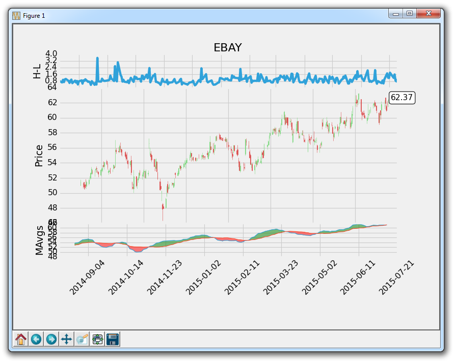
Starting to look a lot better! Still a few more things for us to clean up, however.
-
Introduction to Matplotlib and basic line
-
Legends, Titles, and Labels with Matplotlib
-
Bar Charts and Histograms with Matplotlib
-
Scatter Plots with Matplotlib
-
Stack Plots with Matplotlib
-
Pie Charts with Matplotlib
-
Loading Data from Files for Matplotlib
-
Data from the Internet for Matplotlib
-
Converting date stamps for Matplotlib
-
Basic customization with Matplotlib
-
Unix Time with Matplotlib
-
Colors and Fills with Matplotlib
-
Spines and Horizontal Lines with Matplotlib
-
Candlestick OHLC graphs with Matplotlib
-
Styles with Matplotlib
-
Live Graphs with Matplotlib
-
Annotations and Text with Matplotlib
-
Annotating Last Price Stock Chart with Matplotlib
-
Subplots with Matplotlib
-
Implementing Subplots to our Chart with Matplotlib
-
More indicator data with Matplotlib
-
Custom fills, pruning, and cleaning with Matplotlib
-
Share X Axis, sharex, with Matplotlib
-
Multi Y Axis with twinx Matplotlib
-
Custom Legends with Matplotlib
-
Basemap Geographic Plotting with Matplotlib
-
Basemap Customization with Matplotlib
-
Plotting Coordinates in Basemap with Matplotlib
-
3D graphs with Matplotlib
-
3D Scatter Plot with Matplotlib
-
3D Bar Chart with Matplotlib
-
Conclusion with Matplotlib
