Candlestick OHLC graphs with Matplotlib
In this Matplotlib tutorial, we're going to cover how to create open, high, low, close (OHLC) candlestick charts within Matplotlib. These graphs are used to display time-series stock price information in a condensed form. To do this, we first need a few more imports:
import matplotlib.ticker as mticker
from matplotlib.finance import candlestick_ohlc
We bring in ticker to allow us to modify the ticker information at the bottom of the graph. Then we bring in the candlestick_ohlc functionality from the matplotlib.finance module.
Now, we need to organize our data to work with what matplotlib wants. If you're just now joining us, we're getting data like so:
    # Unfortunately, Yahoo's API is no longer available
    # feel free to adapt the code to another source, or use this drop-in replacement.
    stock_price_url = 'https://pythonprogramming.net/yahoo_finance_replacement'
    source_code = urllib.request.urlopen(stock_price_url).read().decode()
    stock_data = []
    split_source = source_code.split('\n')
    for line in split_source[1:]:
        split_line = line.split(',')
        if len(split_line) == 7:
            if 'values' not in line and 'labels' not in line:
                stock_data.append(line)


    date, closep, highp, lowp, openp, adj_closep, volume = np.loadtxt(stock_data,
                                                          delimiter=',',
                                                          unpack=True,
                                                          converters={0: bytespdate2num('%Y-%m-%d')})
Now, we need to build a Python list, where each element is that data. We could modify our loadtxt function to just not unpack, but later on we will also want to reference specific data points. We could work around this, but we might as well just have two separate data sets in the end. To do this, we'll just do:
    x = 0
    y = len(date)
    ohlc = []

    while x < y:
        append_me = date[x], openp[x], highp[x], lowp[x], closep[x], volume[x]
        ohlc.append(append_me)
        x+=1
With this, we now have a list of OHLC data stored to our variable called ohlc. Now we can plot this with:
candlestick_ohlc(ax1, ohlc)
Graphing this should give us something like:
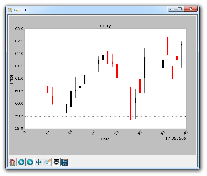
Unfortunately, the datetime data on the x axis is not in datestamp form. We can handle for this:
ax1.xaxis.set_major_formatter(mdates.DateFormatter('%Y-%m-%d'))
Also, the red/black coloring isn't the best choice in my opinion. We should use green for rises and red for falls. To do this, we can do:
candlestick_ohlc(ax1, ohlc, width=0.4, colorup='#77d879', colordown='#db3f3f')
Finally, we can set the number of x labels we want, like so:
ax1.xaxis.set_major_locator(mticker.MaxNLocator(10))
Now, our full code should look something like:
import matplotlib.pyplot as plt
import matplotlib.dates as mdates
import matplotlib.ticker as mticker
from matplotlib.finance import candlestick_ohlc

import numpy as np
import urllib
import datetime as dt


def bytespdate2num(fmt, encoding='utf-8'):
    strconverter = mdates.strpdate2num(fmt)
    def bytesconverter(b):
        s = b.decode(encoding)
        return strconverter(s)
    return bytesconverter


def graph_data(stock):

    fig = plt.figure()
    ax1 = plt.subplot2grid((1,1), (0,0))

    # Unfortunately, Yahoo's API is no longer available
    # feel free to adapt the code to another source, or use this drop-in replacement.
    stock_price_url = 'https://pythonprogramming.net/yahoo_finance_replacement'
    source_code = urllib.request.urlopen(stock_price_url).read().decode()
    stock_data = []
    split_source = source_code.split('\n')
    for line in split_source[1:]:
        split_line = line.split(',')
        if len(split_line) == 7:
            if 'values' not in line and 'labels' not in line:
                stock_data.append(line)


    date, closep, highp, lowp, openp, adj_closep, volume = np.loadtxt(stock_data,
                                                          delimiter=',',
                                                          unpack=True,
                                                          converters={0: bytespdate2num('%Y-%m-%d')})

    x = 0
    y = len(date)
    ohlc = []

    while x < y:
        append_me = date[x], openp[x], highp[x], lowp[x], closep[x], volume[x]
        ohlc.append(append_me)
        x+=1


    candlestick_ohlc(ax1, ohlc, width=0.4, colorup='#77d879', colordown='#db3f3f')

    for label in ax1.xaxis.get_ticklabels():
        label.set_rotation(45)

    ax1.xaxis.set_major_formatter(mdates.DateFormatter('%Y-%m-%d'))
    ax1.xaxis.set_major_locator(mticker.MaxNLocator(10))
    ax1.grid(True)


    plt.xlabel('Date')
    plt.ylabel('Price')
    plt.title(stock)
    plt.legend()
    plt.subplots_adjust(left=0.09, bottom=0.20, right=0.94, top=0.90, wspace=0.2, hspace=0)
    plt.show()


graph_data('EBAY')
The result:
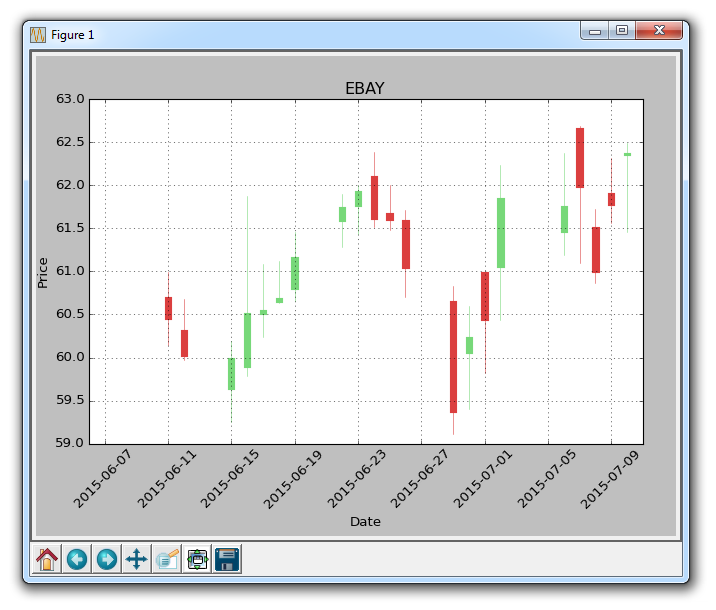
Also note that we've removed most of the ax1 modifications from the previous tutorials.
There exists 1 quiz/question(s) for this tutorial. for access to these, video downloads, and no ads.
-
Introduction to Matplotlib and basic line
-
Legends, Titles, and Labels with Matplotlib
-
Bar Charts and Histograms with Matplotlib
-
Scatter Plots with Matplotlib
-
Stack Plots with Matplotlib
-
Pie Charts with Matplotlib
-
Loading Data from Files for Matplotlib
-
Data from the Internet for Matplotlib
-
Converting date stamps for Matplotlib
-
Basic customization with Matplotlib
-
Unix Time with Matplotlib
-
Colors and Fills with Matplotlib
-
Spines and Horizontal Lines with Matplotlib
-
Candlestick OHLC graphs with Matplotlib
-
Styles with Matplotlib
-
Live Graphs with Matplotlib
-
Annotations and Text with Matplotlib
-
Annotating Last Price Stock Chart with Matplotlib
-
Subplots with Matplotlib
-
Implementing Subplots to our Chart with Matplotlib
-
More indicator data with Matplotlib
-
Custom fills, pruning, and cleaning with Matplotlib
-
Share X Axis, sharex, with Matplotlib
-
Multi Y Axis with twinx Matplotlib
-
Custom Legends with Matplotlib
-
Basemap Geographic Plotting with Matplotlib
-
Basemap Customization with Matplotlib
-
Plotting Coordinates in Basemap with Matplotlib
-
3D graphs with Matplotlib
-
3D Scatter Plot with Matplotlib
-
3D Bar Chart with Matplotlib
-
Conclusion with Matplotlib
