Bar Charts and Histograms with Matplotlib
In this tutorial, we cover bar charts and histograms with Matplotlib. First, let's cover a bar chart.
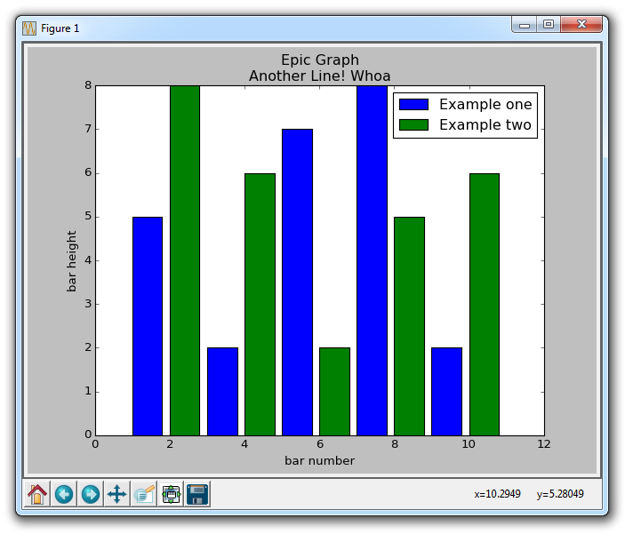
import matplotlib.pyplot as plt
	  plt.bar([1,3,5,7,9],[5,2,7,8,2], label="Example one")

plt.bar([2,4,6,8,10],[8,6,2,5,6], label="Example two", color='g')
plt.legend()
plt.xlabel('bar number')
plt.ylabel('bar height')

plt.title('Epic Graph\nAnother Line! Whoa')

plt.show()
The plt.bar creates the bar chart for us. If you do not explicitly choose a color, then, despite doing multiple plots, all bars will look the same. This gives us a change to cover a new Matplotlib customization option, however. You can use color to color just about any kind of plot, using colors like g for green, b for blue, r for red, and so on. You can also use hex color codes, like #191970
Next, we can cover histograms. Very much like a bar chart, histograms tend to show distribution by grouping segments together. Examples of this might be age groups, or scores on a test. Rather than showing every single age a group might be, maybe you just show people from 20-25, 25-30... and so on. Here's an example:
import matplotlib.pyplot as plt

population_ages = [22,55,62,45,21,22,34,42,42,4,99,102,110,120,121,122,130,111,115,112,80,75,65,54,44,43,42,48]

bins = [0,10,20,30,40,50,60,70,80,90,100,110,120,130]

plt.hist(population_ages, bins, histtype='bar', rwidth=0.8)

plt.xlabel('x')
plt.ylabel('y')
plt.title('Interesting Graph\nCheck it out')
plt.legend()
plt.show()
The resulting graph is:
For plt.hist, you first put in all of the values, then you specify into what "bins" or containers you will place the data into. In our case, we are plotting a bunch of ages, and we want to display them in terms of increments of 10 years. We give the bars a width of 0.8, but you can choose something else if you want to make the bars thicker, or thinner.
-
Introduction to Matplotlib and basic line
-
Legends, Titles, and Labels with Matplotlib
-
Bar Charts and Histograms with Matplotlib
-
Scatter Plots with Matplotlib
-
Stack Plots with Matplotlib
-
Pie Charts with Matplotlib
-
Loading Data from Files for Matplotlib
-
Data from the Internet for Matplotlib
-
Converting date stamps for Matplotlib
-
Basic customization with Matplotlib
-
Unix Time with Matplotlib
-
Colors and Fills with Matplotlib
-
Spines and Horizontal Lines with Matplotlib
-
Candlestick OHLC graphs with Matplotlib
-
Styles with Matplotlib
-
Live Graphs with Matplotlib
-
Annotations and Text with Matplotlib
-
Annotating Last Price Stock Chart with Matplotlib
-
Subplots with Matplotlib
-
Implementing Subplots to our Chart with Matplotlib
-
More indicator data with Matplotlib
-
Custom fills, pruning, and cleaning with Matplotlib
-
Share X Axis, sharex, with Matplotlib
-
Multi Y Axis with twinx Matplotlib
-
Custom Legends with Matplotlib
-
Basemap Geographic Plotting with Matplotlib
-
Basemap Customization with Matplotlib
-
Plotting Coordinates in Basemap with Matplotlib
-
3D graphs with Matplotlib
-
3D Scatter Plot with Matplotlib
-
3D Bar Chart with Matplotlib
-
Conclusion with Matplotlib
