Stack Plots with Matplotlib
In this Matplotlib data visualization tutorial, we cover how to create stack plots. The idea of stack plots is to show "parts to the whole" over time. A stack plot is basically like a pie-chart, only over time.
Let's consider a situation where we have 24 hours in a day, and we'd like to see how we're spending our time. We'll divide our activities into: Sleeping, eating, working, and playing.
We're going to assume that we're tracking this over the course of 5 days, so our starting data will look like:
import matplotlib.pyplot as plt

days = [1,2,3,4,5]

sleeping = [7,8,6,11,7]
eating =   [2,3,4,3,2]
working =  [7,8,7,2,2]
playing =  [8,5,7,8,13]
So, our "x" axis will consist of the days variable, which is 1,2,3,4, and 5. Then, our constituents for the days are held in their respective activities. To plot them:
plt.stackplot(days, sleeping,eating,working,playing, colors=['m','c','r','k'])

plt.xlabel('x')
plt.ylabel('y')
plt.title('Interesting Graph\nCheck it out')
plt.show()
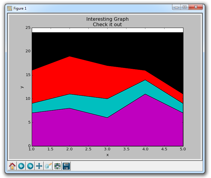
Here, we can see, at least in colors, how we're spending our data. The problem is, we don't really know which color is which without looking back at the code. The next problem is, with polygons, we cannot actually have "labels" for the data. So anywhere where there is more than just a line, with things like fills or stackplots like this, we cannot label the specific parts inherently. That shouldn't stop a programmer however. We can hack our way around this:
import matplotlib.pyplot as plt

days = [1,2,3,4,5]

sleeping = [7,8,6,11,7]
eating =   [2,3,4,3,2]
working =  [7,8,7,2,2]
playing =  [8,5,7,8,13]


plt.plot([],[],color='m', label='Sleeping', linewidth=5)
plt.plot([],[],color='c', label='Eating', linewidth=5)
plt.plot([],[],color='r', label='Working', linewidth=5)
plt.plot([],[],color='k', label='Playing', linewidth=5)

plt.stackplot(days, sleeping,eating,working,playing, colors=['m','c','r','k'])

plt.xlabel('x')
plt.ylabel('y')
plt.title('Interesting Graph\nCheck it out')
plt.legend()
plt.show()
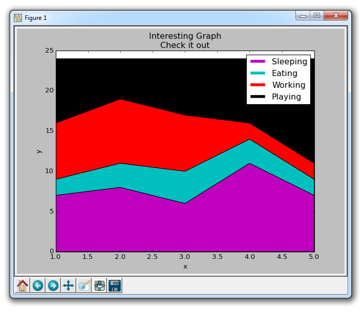
All we did here was plot some empty lines, giving them the same colors, and the correct labels in accordance with our stack plot. We also gave them a linewidth of 5, to make the lines a bit thicker in the legend. Now, we can easily see how we're spending our days!
-
Introduction to Matplotlib and basic line
-
Legends, Titles, and Labels with Matplotlib
-
Bar Charts and Histograms with Matplotlib
-
Scatter Plots with Matplotlib
-
Stack Plots with Matplotlib
-
Pie Charts with Matplotlib
-
Loading Data from Files for Matplotlib
-
Data from the Internet for Matplotlib
-
Converting date stamps for Matplotlib
-
Basic customization with Matplotlib
-
Unix Time with Matplotlib
-
Colors and Fills with Matplotlib
-
Spines and Horizontal Lines with Matplotlib
-
Candlestick OHLC graphs with Matplotlib
-
Styles with Matplotlib
-
Live Graphs with Matplotlib
-
Annotations and Text with Matplotlib
-
Annotating Last Price Stock Chart with Matplotlib
-
Subplots with Matplotlib
-
Implementing Subplots to our Chart with Matplotlib
-
More indicator data with Matplotlib
-
Custom fills, pruning, and cleaning with Matplotlib
-
Share X Axis, sharex, with Matplotlib
-
Multi Y Axis with twinx Matplotlib
-
Custom Legends with Matplotlib
-
Basemap Geographic Plotting with Matplotlib
-
Basemap Customization with Matplotlib
-
Plotting Coordinates in Basemap with Matplotlib
-
3D graphs with Matplotlib
-
3D Scatter Plot with Matplotlib
-
3D Bar Chart with Matplotlib
-
Conclusion with Matplotlib
