Pie Charts with Matplotlib
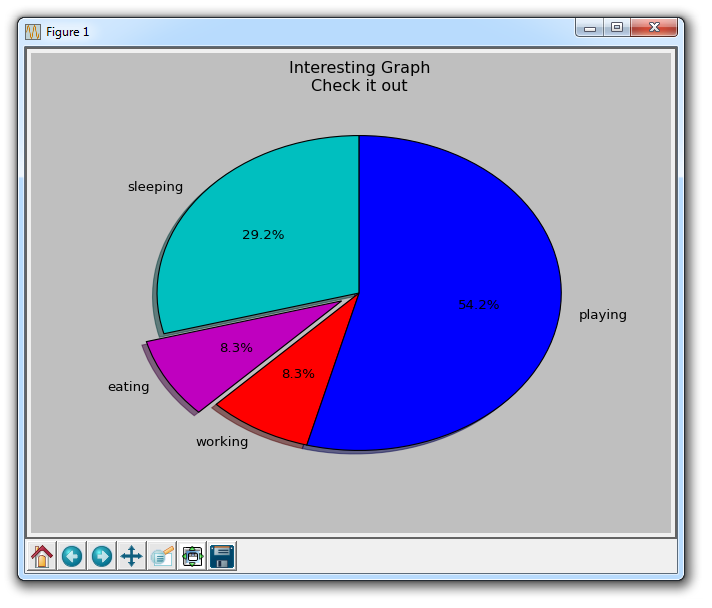
Pie charts are a lot like the stack plots, only they are for a certain point in time. Typically, a Pie Chart is used to show parts to the whole, and often a % share. Luckily for us, Matplotlib handles the sizes of the slices and everything, we just feed it the numbers.
import matplotlib.pyplot as plt

slices = [7,2,2,13]
activities = ['sleeping','eating','working','playing']
cols = ['c','m','r','b']

plt.pie(slices,
        labels=activities,
        colors=cols,
        startangle=90,
        shadow= True,
        explode=(0,0.1,0,0),
        autopct='%1.1f%%')

plt.title('Interesting Graph\nCheck it out')
plt.show()

Within the plt.pie, we specify the "slices," which are the relevant sizes for each part. Then, we specify the color list for the corresponding slices. Next, we can optionally specify the "Start angle" for the graph. This lets you start the line where you want. In our case, we chose a 90 degree angle for the pie chart, which means the first division will be a verticle line. Next, we can optionally add a shadow to the plot for a bit of character, and then we can even use "explode" to pull out a slice a bit.
We have four total slices, so, with explode, if we didn't want to pull out any slices at all, we would do 0,0,0,0. If we wanted to pull out the first slice a bit, we would do 0.1,0,0,0.
Finally, we do autopct to optionally overlay the percentages on to the graph itself.
-
Introduction to Matplotlib and basic line
-
Legends, Titles, and Labels with Matplotlib
-
Bar Charts and Histograms with Matplotlib
-
Scatter Plots with Matplotlib
-
Stack Plots with Matplotlib
-
Pie Charts with Matplotlib
-
Loading Data from Files for Matplotlib
-
Data from the Internet for Matplotlib
-
Converting date stamps for Matplotlib
-
Basic customization with Matplotlib
-
Unix Time with Matplotlib
-
Colors and Fills with Matplotlib
-
Spines and Horizontal Lines with Matplotlib
-
Candlestick OHLC graphs with Matplotlib
-
Styles with Matplotlib
-
Live Graphs with Matplotlib
-
Annotations and Text with Matplotlib
-
Annotating Last Price Stock Chart with Matplotlib
-
Subplots with Matplotlib
-
Implementing Subplots to our Chart with Matplotlib
-
More indicator data with Matplotlib
-
Custom fills, pruning, and cleaning with Matplotlib
-
Share X Axis, sharex, with Matplotlib
-
Multi Y Axis with twinx Matplotlib
-
Custom Legends with Matplotlib
-
Basemap Geographic Plotting with Matplotlib
-
Basemap Customization with Matplotlib
-
Plotting Coordinates in Basemap with Matplotlib
-
3D graphs with Matplotlib
-
3D Scatter Plot with Matplotlib
-
3D Bar Chart with Matplotlib
-
Conclusion with Matplotlib
