Custom Legends with Matplotlib
In this Matplotlib tutorial, we're going to be going over custom legends. We've covered the basics of adding a legend already.
The main issue with legends is typically that the legend gets in the way of data. There are a few options here. One option is to put the legend outside of the axis, but we have multiple subplots here and that would be pretty difficult. Instead, we'll make the legend a bit smaller, and then apply an alpha to it.
First, to have a legend, we need to add labels to our data that we want to show up on the legend.
    ax1.plot_date(date[-start:],h_l[-start:],'-', label='H-L')
	...
    ax2v.plot([],[], color='#0079a3', alpha=0.4, label='Volume')
	...
    ax3.plot(date[-start:], ma1[-start:], linewidth=1, label=(str(MA1)+'MA'))
    ax3.plot(date[-start:], ma2[-start:], linewidth=1, label=(str(MA2)+'MA'))
Take note that we added a label for the volume by creating an empty line. Remember that we cannot apply a label to any fills, so that's why we do this empty line.
Now, we can add the legends in, by doing the following near the bottom, right before plt.show():
    ax1.legend()
    ax2v.legend()
    ax3.legend()
This would give us:
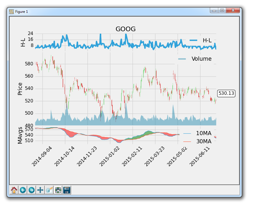
So, as we can see, the legends are in the way a bit. Let's change the location, size, and add an alpha:
    ax1.legend()
    leg = ax1.legend(loc=9, ncol=2,prop={'size':11})
    leg.get_frame().set_alpha(0.4)

    ax2v.legend()
    leg = ax2v.legend(loc=9, ncol=2,prop={'size':11})
    leg.get_frame().set_alpha(0.4)

    ax3.legend()
    leg = ax3.legend(loc=9, ncol=2,prop={'size':11})
    leg.get_frame().set_alpha(0.4)
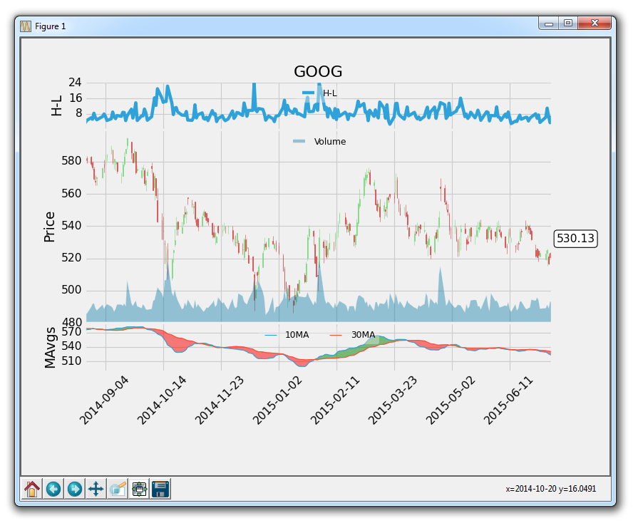
All of the legends here are taking location 9, which is the upper middle. There are many locations, feel free to put different location numbers in there to see where they all go. The ncol parameter lets us specify the number of columns in the legend. With just one column, if you have 2 things in the legend, they will stack on top of each other in 1 column. Finally, we identify the size as a bit smaller. After this, we apply an alpha of 0.4 to the entire legend.
Now our result is:
The full code for this:
import matplotlib.pyplot as plt
import matplotlib.dates as mdates
import matplotlib.ticker as mticker
from matplotlib.finance import candlestick_ohlc
from matplotlib import style

import numpy as np
import urllib
import datetime as dt

style.use('fivethirtyeight')
print(plt.style.available)

print(plt.__file__)

MA1 = 10
MA2 = 30

def moving_average(values, window):
    weights = np.repeat(1.0, window)/window
    smas = np.convolve(values, weights, 'valid')
    return smas

def high_minus_low(highs, lows):
    return highs-lows


def bytespdate2num(fmt, encoding='utf-8'):
    strconverter = mdates.strpdate2num(fmt)
    def bytesconverter(b):
        s = b.decode(encoding)
        return strconverter(s)
    return bytesconverter


def graph_data(stock):

    fig = plt.figure(facecolor='#f0f0f0')
    ax1 = plt.subplot2grid((6,1), (0,0), rowspan=1, colspan=1)
    plt.title(stock)
    plt.ylabel('H-L')
    ax2 = plt.subplot2grid((6,1), (1,0), rowspan=4, colspan=1, sharex=ax1)
    plt.ylabel('Price')
    ax2v = ax2.twinx()

    ax3 = plt.subplot2grid((6,1), (5,0), rowspan=1, colspan=1, sharex=ax1)
    plt.ylabel('MAvgs')


    stock_price_url = 'http://chartapi.finance.yahoo.com/instrument/1.0/'+stock+'/chartdata;type=quote;range=1y/csv'
    source_code = urllib.request.urlopen(stock_price_url).read().decode()
    stock_data = []
    split_source = source_code.split('\n')
    for line in split_source:
        split_line = line.split(',')
        if len(split_line) == 6:
            if 'values' not in line and 'labels' not in line:
                stock_data.append(line)


    date, closep, highp, lowp, openp, volume = np.loadtxt(stock_data,
                                                          delimiter=',',
                                                          unpack=True,
                                                          converters={0: bytespdate2num('%Y%m%d')})

    x = 0
    y = len(date)
    ohlc = []

    while x < y:
        append_me = date[x], openp[x], highp[x], lowp[x], closep[x], volume[x]
        ohlc.append(append_me)
        x+=1

    ma1 = moving_average(closep,MA1)
    ma2 = moving_average(closep,MA2)
    start = len(date[MA2-1:])

    h_l = list(map(high_minus_low, highp, lowp))


    ax1.plot_date(date[-start:],h_l[-start:],'-', label='H-L')
    ax1.yaxis.set_major_locator(mticker.MaxNLocator(nbins=4, prune='lower'))


    candlestick_ohlc(ax2, ohlc[-start:], width=0.4, colorup='#77d879', colordown='#db3f3f')


    ax2.yaxis.set_major_locator(mticker.MaxNLocator(nbins=7, prune='upper'))
    ax2.grid(True)

    bbox_props = dict(boxstyle='round',fc='w', ec='k',lw=1)

    ax2.annotate(str(closep[-1]), (date[-1], closep[-1]),
                 xytext = (date[-1]+4, closep[-1]), bbox=bbox_props)

##    # Annotation example with arrow
##    ax2.annotate('Bad News!',(date[11],highp[11]),
##                 xytext=(0.8, 0.9), textcoords='axes fraction',
##                 arrowprops = dict(facecolor='grey',color='grey'))
##
##
##    # Font dict example
##    font_dict = {'family':'serif',
##                 'color':'darkred',
##                 'size':15}
##    # Hard coded text
##    ax2.text(date[10], closep[1],'Text Example', fontdict=font_dict)

    ax2v.plot([],[], color='#0079a3', alpha=0.4, label='Volume')
    ax2v.fill_between(date[-start:],0, volume[-start:], facecolor='#0079a3', alpha=0.4)
    ax2v.axes.yaxis.set_ticklabels([])
    ax2v.grid(False)
    ax2v.set_ylim(0, 3*volume.max())


    ax3.plot(date[-start:], ma1[-start:], linewidth=1, label=(str(MA1)+'MA'))
    ax3.plot(date[-start:], ma2[-start:], linewidth=1, label=(str(MA2)+'MA'))

    ax3.fill_between(date[-start:], ma2[-start:], ma1[-start:],
                     where=(ma1[-start:] < ma2[-start:]),
                     facecolor='r', edgecolor='r', alpha=0.5)

    ax3.fill_between(date[-start:], ma2[-start:], ma1[-start:],
                     where=(ma1[-start:] > ma2[-start:]),
                     facecolor='g', edgecolor='g', alpha=0.5)

    ax3.xaxis.set_major_formatter(mdates.DateFormatter('%Y-%m-%d'))
    ax3.xaxis.set_major_locator(mticker.MaxNLocator(10))
    ax3.yaxis.set_major_locator(mticker.MaxNLocator(nbins=4, prune='upper'))

    for label in ax3.xaxis.get_ticklabels():
        label.set_rotation(45)


    plt.setp(ax1.get_xticklabels(), visible=False)
    plt.setp(ax2.get_xticklabels(), visible=False)
    plt.subplots_adjust(left=0.11, bottom=0.24, right=0.90, top=0.90, wspace=0.2, hspace=0)

    ax1.legend()
    leg = ax1.legend(loc=9, ncol=2,prop={'size':11})
    leg.get_frame().set_alpha(0.4)

    ax2v.legend()
    leg = ax2v.legend(loc=9, ncol=2,prop={'size':11})
    leg.get_frame().set_alpha(0.4)

    ax3.legend()
    leg = ax3.legend(loc=9, ncol=2,prop={'size':11})
    leg.get_frame().set_alpha(0.4)

    plt.show()
    fig.savefig('google.png', facecolor=fig.get_facecolor())


graph_data('GOOG')
Now we can see the legend, but also see any information that is under the legend. Also note the "fig.savefig" addition. This is how you can automatically save an image of the graph. We can also set the facecolor of the saved figure, so the background isn't white, as shown in our example.
That's all that I would like to show with typical Matplotlib graphs for now. Next, we're going to cover Basemap, which is a Matplotlib extension for plotting geographically, and then I would like to cover 3D graphing in Matplotlib!
-
Introduction to Matplotlib and basic line
-
Legends, Titles, and Labels with Matplotlib
-
Bar Charts and Histograms with Matplotlib
-
Scatter Plots with Matplotlib
-
Stack Plots with Matplotlib
-
Pie Charts with Matplotlib
-
Loading Data from Files for Matplotlib
-
Data from the Internet for Matplotlib
-
Converting date stamps for Matplotlib
-
Basic customization with Matplotlib
-
Unix Time with Matplotlib
-
Colors and Fills with Matplotlib
-
Spines and Horizontal Lines with Matplotlib
-
Candlestick OHLC graphs with Matplotlib
-
Styles with Matplotlib
-
Live Graphs with Matplotlib
-
Annotations and Text with Matplotlib
-
Annotating Last Price Stock Chart with Matplotlib
-
Subplots with Matplotlib
-
Implementing Subplots to our Chart with Matplotlib
-
More indicator data with Matplotlib
-
Custom fills, pruning, and cleaning with Matplotlib
-
Share X Axis, sharex, with Matplotlib
-
Multi Y Axis with twinx Matplotlib
-
Custom Legends with Matplotlib
-
Basemap Geographic Plotting with Matplotlib
-
Basemap Customization with Matplotlib
-
Plotting Coordinates in Basemap with Matplotlib
-
3D graphs with Matplotlib
-
3D Scatter Plot with Matplotlib
-
3D Bar Chart with Matplotlib
-
Conclusion with Matplotlib
