Plotting Coordinates in Basemap with Matplotlib
Welcome to another Basemap with Matplotlib tutorial. In this tutorial, we're going to cover how to plot single coordinates, as well as how to connect those coordinates in your geographic plot.
First, we're going to start with some basic starting data:
from mpl_toolkits.basemap import Basemap
import matplotlib.pyplot as plt

m = Basemap(projection='mill',
            llcrnrlat = 25,
            llcrnrlon = -130,
            urcrnrlat = 50,
            urcrnrlon = -60,
            resolution='l')

m.drawcoastlines()
m.drawcountries(linewidth=2)
m.drawstates(color='b')
Next, we can plot coordinates, starting by getting their actual coordinates. Remember, southern and western coordinates are converted to negative values. For example, New York City is 40.7127 North 74.0059 West. We can define these coordinates in our program like:
NYClat, NYClon = 40.7127, -74.0059
We then convert these to x and y coordinates to be plotted with:
xpt, ypt = m(NYClon, NYClat)
Note here that we've now flipped the coordinate order to lon,lat. Coordinates are usually given in lat,lon order. In terms of graphs, however, lat long translates to y,x, which we obviously do not want. At some point, you have to flip these. Don't forget this part!
Finally, we can plot coordinates like so:
m.plot(xpt, ypt, 'c*', markersize=15)
This plots with a cyan colored star, with a size of 15. For more marker types, see: Matplotlib Marker Documentation.
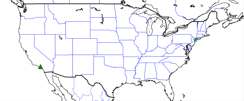
Next, let's plot one more location, Los Angeles, California:
LAlat, LAlon = 34.05, -118.25
xpt, ypt = m(LAlon, LAlat)
m.plot(xpt, ypt, 'g^', markersize=15)
This time we plot a green triangle. Running this code gives us:
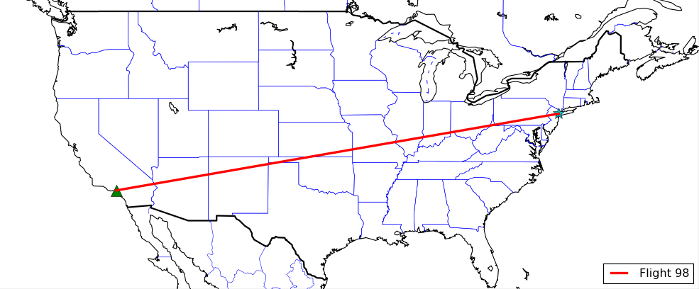
What if we wanted to connect these plots? Turns out, we can do this no different than we would any other typical Matplotlib graph.
First, we save those xpt and ypt coordinates to lists, something like this will do:
xs = []
ys = []

NYClat, NYClon = 40.7127, -74.0059
xpt, ypt = m(NYClon, NYClat)
xs.append(xpt)
ys.append(ypt)
m.plot(xpt, ypt, 'c*', markersize=15)

LAlat, LAlon = 34.05, -118.25
xpt, ypt = m(LAlon, LAlat)
xs.append(xpt)
ys.append(ypt)
m.plot(xpt, ypt, 'g^', markersize=15)

m.plot(xs, ys, color='r', linewidth=3, label='Flight 98')
This gives you:
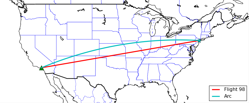
Awesome. Sometimes people connect coordinates on graphs with a bit of an arc. How might we achieve this?
m.drawgreatcircle(NYClon, NYClat, LAlon, LAlat, color='c', linewidth=3, label='Arc')
Our full code now is:
from mpl_toolkits.basemap import Basemap
import matplotlib.pyplot as plt

m = Basemap(projection='mill',
            llcrnrlat = 25,
            llcrnrlon = -130,
            urcrnrlat = 50,
            urcrnrlon = -60,
            resolution='l')

m.drawcoastlines()
m.drawcountries(linewidth=2)
m.drawstates(color='b')
#m.drawcounties(color='darkred')
#m.fillcontinents()
#m.etopo()
#m.bluemarble()

xs = []
ys = []

NYClat, NYClon = 40.7127, -74.0059
xpt, ypt = m(NYClon, NYClat)
xs.append(xpt)
ys.append(ypt)
m.plot(xpt, ypt, 'c*', markersize=15)

LAlat, LAlon = 34.05, -118.25
xpt, ypt = m(LAlon, LAlat)
xs.append(xpt)
ys.append(ypt)
m.plot(xpt, ypt, 'g^', markersize=15)

m.plot(xs, ys, color='r', linewidth=3, label='Flight 98')
m.drawgreatcircle(NYClon, NYClat, LAlon, LAlat, color='c', linewidth=3, label='Arc')


plt.legend(loc=4)
plt.title('Basemap Tutorial')
plt.show()
The result:
That's all on Basemap for now. The next section is all about 3D graphing in Matplotlib.
-
Introduction to Matplotlib and basic line
-
Legends, Titles, and Labels with Matplotlib
-
Bar Charts and Histograms with Matplotlib
-
Scatter Plots with Matplotlib
-
Stack Plots with Matplotlib
-
Pie Charts with Matplotlib
-
Loading Data from Files for Matplotlib
-
Data from the Internet for Matplotlib
-
Converting date stamps for Matplotlib
-
Basic customization with Matplotlib
-
Unix Time with Matplotlib
-
Colors and Fills with Matplotlib
-
Spines and Horizontal Lines with Matplotlib
-
Candlestick OHLC graphs with Matplotlib
-
Styles with Matplotlib
-
Live Graphs with Matplotlib
-
Annotations and Text with Matplotlib
-
Annotating Last Price Stock Chart with Matplotlib
-
Subplots with Matplotlib
-
Implementing Subplots to our Chart with Matplotlib
-
More indicator data with Matplotlib
-
Custom fills, pruning, and cleaning with Matplotlib
-
Share X Axis, sharex, with Matplotlib
-
Multi Y Axis with twinx Matplotlib
-
Custom Legends with Matplotlib
-
Basemap Geographic Plotting with Matplotlib
-
Basemap Customization with Matplotlib
-
Plotting Coordinates in Basemap with Matplotlib
-
3D graphs with Matplotlib
-
3D Scatter Plot with Matplotlib
-
3D Bar Chart with Matplotlib
-
Conclusion with Matplotlib
