Data from the Internet for Matplotlib
Aside from loading data from the files, another popular source for data is the internet. We can load data from the internet from a variety of ways, but, for us, we're going to just simply read the source code of the website, then use simple splitting to separate the data.
import matplotlib.pyplot as plt
import numpy as np
import urllib
import matplotlib.dates as mdates


def graph_data(stock):

    stock_price_url = 'http://chartapi.finance.yahoo.com/instrument/1.0/'+stock+'/chartdata;type=quote;range=10y/csv'

    source_code = urllib.request.urlopen(stock_price_url).read().decode()

    stock_data = []
    split_source = source_code.split('\n')

    for line in split_source:
        split_line = line.split(',')
        if len(split_line) == 6:
            if 'values' not in line:
                stock_data.append(line)
There's a lot going on here. First, we see the imports. Pyplot is imported as usual, then numpy, then urllib for accessing the internet, and then matplotlib.dates as mdates, which is useful for converting date stamps to dates that matplotlib can understand.
Next, we begin to build our "graph_data" function. In here, we first define the url that contains the stock data. After that, we write some urllib code to access that url, then read, with .read, the source code, then we go ahead and decode the data. If you're following along with Python 2, it wont be necessary to use decode.
Then, we define an empty list, which is where we'll be placing the stock data shortly, and we also begin to split up the data with the split_source variable, splitting by new lines.
Now, if you go to look at the source code, replacing the "+stock+" in the url with a stock, like AAPL, you can see that most of the page data is indeed stock pricing information, but there is some header information there that we need to filter out. To do this, we'll just use some rudimentary filtration, checking to make sure there are 6 data points per line, and then making sure the term "values" isn't in the line.
Now, we have the data parsed out, and we're ready to munch on it. We're going to use NumPy for this:
    date, closep, highp, lowp, openp, volume = np.loadtxt(stock_data,
                                                          delimiter=',',
                                                          unpack=True,
                                                          # %Y = full year. 2015
                                                          # %y = partial year 15
                                                          # %m = number month
                                                          # %d = number day
                                                          # %H = hours
                                                          # %M = minutes
                                                          # %S = seconds
                                                          # 12-06-2014
                                                          # %m-%d-%Y
                                                          converters={0: bytespdate2num('%Y%m%d')})
What we are doing here, is unpacking these six elements to six variables, with numpy's loadtxt function. The first parameter here is stock_data, which is the data we're loading. Then, we specify the delimiter, which is a comma in this case, then we specify that we indeed want to unpack the variables here not just to one variable, but to this group of variables we've defined. Finally, we use the optional "converters" parameter to specify what element we want to convert (0), and then how we want to do that. We pass a function called bytespdate2num, which doesn't quite exist yet, but we'll write that next.
If you would like to know more about the syntax for date data, check out the posted video, around 9 minutes 35 seconds.
Challenge
Using Matplotlib and Pandas, graph the data found on quandl here: Dropout Data
-
Hints
-
Acquire the data, placing into a dataframe.
import pandas as pd

df = pd.read_csv('https://www.quandl.com/api/v3/datasets/NCES/DROPOUT_RACE.csv')
It is not required that you download CSV files to read them into pandas, so we're just reading in the URL.
-
Graph the data
import pandas as pd
import matplotlib.pyplot as plt
from matplotlib import style
style.use('ggplot')

df = pd.read_csv('https://www.quandl.com/api/v3/datasets/NCES/DROPOUT_RACE.csv')

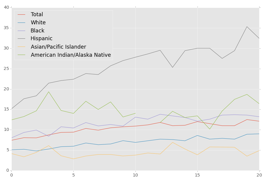
df.plot()
plt.show()
You should now have a graph that looks like:
 .
.
-
-
Introduction to Matplotlib and basic line
-
Legends, Titles, and Labels with Matplotlib
-
Bar Charts and Histograms with Matplotlib
-
Scatter Plots with Matplotlib
-
Stack Plots with Matplotlib
-
Pie Charts with Matplotlib
-
Loading Data from Files for Matplotlib
-
Data from the Internet for MatplotlibYou are currently here.
-
Converting date stamps for Matplotlib
-
Basic customization with Matplotlib
-
Unix Time with Matplotlib
-
Colors and Fills with Matplotlib
-
Spines and Horizontal Lines with Matplotlib
-
Candlestick OHLC graphs with Matplotlib
-
Styles with Matplotlib
-
Live Graphs with Matplotlib
-
Annotations and Text with Matplotlib
-
Annotating Last Price Stock Chart with Matplotlib
-
Subplots with Matplotlib
-
Implementing Subplots to our Chart with Matplotlib
-
More indicator data with Matplotlib
-
Custom fills, pruning, and cleaning with Matplotlib
-
Share X Axis, sharex, with Matplotlib
-
Multi Y Axis with twinx Matplotlib
-
Custom Legends with Matplotlib
-
Basemap Geographic Plotting with Matplotlib
-
Basemap Customization with Matplotlib
-
Plotting Coordinates in Basemap with Matplotlib
-
3D graphs with Matplotlib
-
3D Scatter Plot with Matplotlib
-
3D Bar Chart with Matplotlib
-
Conclusion with Matplotlib