More indicator data with Matplotlib
In this Matplotlib tutorial, we cover adding a couple simple functions to calculate data for us to fill our axis with. One is a simple moving average, the other is a simple high minus low calculation for prices.
These new functions are:
def moving_average(values, window):
    weights = np.repeat(1.0, window)/window
    smas = np.convolve(values, weights, 'valid')
    return smas

def high_minus_low(highs, lows):
    return highs-lows
You do not need to be too focused on understanding how the moving average works, we're just doing this for some sample data so we can learn a bit more about customizing Matplotlib.
We also want to define some values for moving averages at the top of our script:
MA1 = 10
MA2 = 30
Next, within our graph_data function:
    ma1 = moving_average(closep,MA1)
    ma2 = moving_average(closep,MA2)
    start = len(date[MA2-1:])

    h_l = list(map(high_minus_low, highp, lowp))
Here, we calculate two moving averages and the high minus the low.
We also define a "start" point. We do this because we want our data to line up. A 20 moving average requires 20 data points, for example. This means we cannot really calculate a 20 day moving average on day #5. Because of this, we will have to lose some data when we calculate moving averages. To handle for this subtraction of data, we calculate how much data we should have with the start variable. From here, we can safely plot the moving averages with [-start:], and line up data by doing this to all of the plots if we want to.
Next, we can plot the high minus low on ax1 with:
ax1.plot_date(date,h_l,'-')
Finally we can add the moving averages to ax3 with:
    ax3.plot(date[-start:], ma1[-start:])
    ax3.plot(date[-start:], ma2[-start:])
Our full code, including increasing the time range that we've been using:
import matplotlib.pyplot as plt
import matplotlib.dates as mdates
import matplotlib.ticker as mticker
from matplotlib.finance import candlestick_ohlc
from matplotlib import style

import numpy as np
import urllib
import datetime as dt

style.use('fivethirtyeight')
print(plt.style.available)

print(plt.__file__)

MA1 = 10
MA2 = 30

def moving_average(values, window):
    weights = np.repeat(1.0, window)/window
    smas = np.convolve(values, weights, 'valid')
    return smas

def high_minus_low(highs, lows):
    return highs-lows


def bytespdate2num(fmt, encoding='utf-8'):
    strconverter = mdates.strpdate2num(fmt)
    def bytesconverter(b):
        s = b.decode(encoding)
        return strconverter(s)
    return bytesconverter


def graph_data(stock):

    fig = plt.figure()
    ax1 = plt.subplot2grid((6,1), (0,0), rowspan=1, colspan=1)
    plt.title(stock)
    ax2 = plt.subplot2grid((6,1), (1,0), rowspan=4, colspan=1)
    plt.xlabel('Date')
    plt.ylabel('Price')
    ax3 = plt.subplot2grid((6,1), (5,0), rowspan=1, colspan=1)


    stock_price_url = 'http://chartapi.finance.yahoo.com/instrument/1.0/'+stock+'/chartdata;type=quote;range=1y/csv'
    source_code = urllib.request.urlopen(stock_price_url).read().decode()
    stock_data = []
    split_source = source_code.split('\n')
    for line in split_source:
        split_line = line.split(',')
        if len(split_line) == 6:
            if 'values' not in line and 'labels' not in line:
                stock_data.append(line)


    date, closep, highp, lowp, openp, volume = np.loadtxt(stock_data,
                                                          delimiter=',',
                                                          unpack=True,
                                                          converters={0: bytespdate2num('%Y%m%d')})

    x = 0
    y = len(date)
    ohlc = []

    while x < y:
        append_me = date[x], openp[x], highp[x], lowp[x], closep[x], volume[x]
        ohlc.append(append_me)
        x+=1

    ma1 = moving_average(closep,MA1)
    ma2 = moving_average(closep,MA2)
    start = len(date[MA2-1:])

    h_l = list(map(high_minus_low, highp, lowp))

    ax1.plot_date(date,h_l,'-')


    candlestick_ohlc(ax2, ohlc, width=0.4, colorup='#77d879', colordown='#db3f3f')

    for label in ax2.xaxis.get_ticklabels():
        label.set_rotation(45)

    ax2.xaxis.set_major_formatter(mdates.DateFormatter('%Y-%m-%d'))
    ax2.xaxis.set_major_locator(mticker.MaxNLocator(10))
    ax2.grid(True)

    bbox_props = dict(boxstyle='round',fc='w', ec='k',lw=1)

    ax2.annotate(str(closep[-1]), (date[-1], closep[-1]),
                 xytext = (date[-1]+4, closep[-1]), bbox=bbox_props)


##    # Annotation example with arrow
##    ax2.annotate('Bad News!',(date[11],highp[11]),
##                 xytext=(0.8, 0.9), textcoords='axes fraction',
##                 arrowprops = dict(facecolor='grey',color='grey'))
##
##
##    # Font dict example
##    font_dict = {'family':'serif',
##                 'color':'darkred',
##                 'size':15}
##    # Hard coded text
##    ax2.text(date[10], closep[1],'Text Example', fontdict=font_dict)


    ax3.plot(date[-start:], ma1[-start:])
    ax3.plot(date[-start:], ma2[-start:])


    plt.subplots_adjust(left=0.11, bottom=0.24, right=0.90, top=0.90, wspace=0.2, hspace=0)
    plt.show()


graph_data('EBAY')
This code gives us something like:
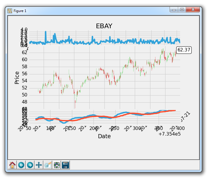
Making progress, but we still have a lot of clealning to do! In the next tutorial, we'll be cleaning things up a bit, and showing a dynamic fill.
-
Introduction to Matplotlib and basic line
-
Legends, Titles, and Labels with Matplotlib
-
Bar Charts and Histograms with Matplotlib
-
Scatter Plots with Matplotlib
-
Stack Plots with Matplotlib
-
Pie Charts with Matplotlib
-
Loading Data from Files for Matplotlib
-
Data from the Internet for Matplotlib
-
Converting date stamps for Matplotlib
-
Basic customization with Matplotlib
-
Unix Time with Matplotlib
-
Colors and Fills with Matplotlib
-
Spines and Horizontal Lines with Matplotlib
-
Candlestick OHLC graphs with Matplotlib
-
Styles with Matplotlib
-
Live Graphs with Matplotlib
-
Annotations and Text with Matplotlib
-
Annotating Last Price Stock Chart with Matplotlib
-
Subplots with Matplotlib
-
Implementing Subplots to our Chart with Matplotlib
-
More indicator data with Matplotlib
-
Custom fills, pruning, and cleaning with Matplotlib
-
Share X Axis, sharex, with Matplotlib
-
Multi Y Axis with twinx Matplotlib
-
Custom Legends with Matplotlib
-
Basemap Geographic Plotting with Matplotlib
-
Basemap Customization with Matplotlib
-
Plotting Coordinates in Basemap with Matplotlib
-
3D graphs with Matplotlib
-
3D Scatter Plot with Matplotlib
-
3D Bar Chart with Matplotlib
-
Conclusion with Matplotlib
