Legends, Titles, and Labels with Matplotlib
In this tutorial, we're going to cover legends, titles, and labels within Matplotlib. A lot of times, graphs can be self-explanatory, but having a title to the graph, labels on the axis, and a legend that explains what each line is can be necessary.
To start:
import matplotlib.pyplot as plt

x = [1,2,3]
y = [5,7,4]

x2 = [1,2,3]
y2 = [10,14,12]
This way, we have two lines that we can plot. Next:
plt.plot(x, y, label='First Line')
plt.plot(x2, y2, label='Second Line')
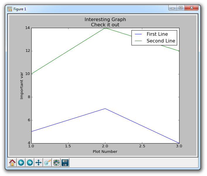
Here, we plot as we've seen already, only this time we add another parameter "label." This allows us to assign a name to the line, which we can later show in the legend. The rest of our code:
plt.xlabel('Plot Number')
plt.ylabel('Important var')
plt.title('Interesting Graph\nCheck it out')
plt.legend()
plt.show()
With plt.xlabel and plt.ylabel, we can assign labels to those respective axis. Next, we can assign the plot's title with plt.title, and then we can invoke the default legend with plt.legend(). The resulting graph:

There exists 3 quiz/question(s) for this tutorial. for access to these, video downloads, and no ads.
-
Introduction to Matplotlib and basic line
-
Legends, Titles, and Labels with Matplotlib
-
Bar Charts and Histograms with Matplotlib
-
Scatter Plots with Matplotlib
-
Stack Plots with Matplotlib
-
Pie Charts with Matplotlib
-
Loading Data from Files for Matplotlib
-
Data from the Internet for Matplotlib
-
Converting date stamps for Matplotlib
-
Basic customization with Matplotlib
-
Unix Time with Matplotlib
-
Colors and Fills with Matplotlib
-
Spines and Horizontal Lines with Matplotlib
-
Candlestick OHLC graphs with Matplotlib
-
Styles with Matplotlib
-
Live Graphs with Matplotlib
-
Annotations and Text with Matplotlib
-
Annotating Last Price Stock Chart with Matplotlib
-
Subplots with Matplotlib
-
Implementing Subplots to our Chart with Matplotlib
-
More indicator data with Matplotlib
-
Custom fills, pruning, and cleaning with Matplotlib
-
Share X Axis, sharex, with Matplotlib
-
Multi Y Axis with twinx Matplotlib
-
Custom Legends with Matplotlib
-
Basemap Geographic Plotting with Matplotlib
-
Basemap Customization with Matplotlib
-
Plotting Coordinates in Basemap with Matplotlib
-
3D graphs with Matplotlib
-
3D Scatter Plot with Matplotlib
-
3D Bar Chart with Matplotlib
-
Conclusion with Matplotlib
