Annotations and Text with Matplotlib
In this tutorial, we're going to be talking about how we add text to Matplotlib graphs. We can do this in two ways. One is to just place text to a location on the graph. Another is to specifically annotate a plot on the chart to draw attention to it.
The starting point code here is going to be tutorial #15, which is here:
import matplotlib.pyplot as plt
import matplotlib.dates as mdates
import matplotlib.ticker as mticker
from matplotlib.finance import candlestick_ohlc
from matplotlib import style

import numpy as np
import urllib
import datetime as dt

style.use('fivethirtyeight')
print(plt.style.available)

print(plt.__file__)


def bytespdate2num(fmt, encoding='utf-8'):
    strconverter = mdates.strpdate2num(fmt)
    def bytesconverter(b):
        s = b.decode(encoding)
        return strconverter(s)
    return bytesconverter


def graph_data(stock):

    fig = plt.figure()
    ax1 = plt.subplot2grid((1,1), (0,0))

    stock_price_url = 'http://chartapi.finance.yahoo.com/instrument/1.0/'+stock+'/chartdata;type=quote;range=1m/csv'
    source_code = urllib.request.urlopen(stock_price_url).read().decode()
    stock_data = []
    split_source = source_code.split('\n')
    for line in split_source:
        split_line = line.split(',')
        if len(split_line) == 6:
            if 'values' not in line and 'labels' not in line:
                stock_data.append(line)


    date, closep, highp, lowp, openp, volume = np.loadtxt(stock_data,
                                                          delimiter=',',
                                                          unpack=True,
                                                          converters={0: bytespdate2num('%Y%m%d')})

    x = 0
    y = len(date)
    ohlc = []

    while x < y:
        append_me = date[x], openp[x], highp[x], lowp[x], closep[x], volume[x]
        ohlc.append(append_me)
        x+=1


    candlestick_ohlc(ax1, ohlc, width=0.4, colorup='#77d879', colordown='#db3f3f')

    for label in ax1.xaxis.get_ticklabels():
        label.set_rotation(45)

    ax1.xaxis.set_major_formatter(mdates.DateFormatter('%Y-%m-%d'))
    ax1.xaxis.set_major_locator(mticker.MaxNLocator(10))
    ax1.grid(True)


    plt.xlabel('Date')
    plt.ylabel('Price')
    plt.title(stock)
    plt.subplots_adjust(left=0.09, bottom=0.20, right=0.94, top=0.90, wspace=0.2, hspace=0)
    plt.show()


graph_data('ebay')
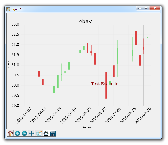
So here we have the OHLC candlestick chart for eBay from the Yahoo Finance API. The first thing we're going to cover is just adding text to the graph here.
    font_dict = {'family':'serif',
                 'color':'darkred',
                 'size':15}
    ax1.text(date[10], closep[1],'Text Example', fontdict=font_dict)
Here, we're doing a frew things. First, we use ax1.text to add text. We give the location of this text in coordinate form, using our data. First you give the coordinates for the text, then you give the actual text that you want to place. Next, we're using the fontdict parameter to also add a dictionary of data to apply to the font used. In our font dict, we change the font to serif, color it "dark red" and then change the size of the font to 15. This is all then applied to our text on the graph, like so:
Great, next what we can do is annotate to a specific plot. We might want to do this to give more information to the plot. In the case of eBay, maybe we want to explain a specific plot or give some information as to what happened. In the case of stock prices, maybe some news came out that affected price sigificantly. You could annotate where the news came, which would help explain pricing changes.
    ax1.annotate('Bad News!',(date[9],highp[9]),
                 xytext=(0.8, 0.9), textcoords='axes fraction',
                 arrowprops = dict(facecolor='grey',color='grey'))
Here, we annotate with ax1.annotate. We first pass the text that we want to annotate, then we pass the coordinates that we want this annotation to point to, or be for. We do this, because we can draw lines and arrows to the specific point when we annotate. Next, we specify the location of xytext. This could be a coordinate location like we used for the text-placement, but let's show another example. This one will be an axes fraction. So we use 0.8 and 0.9. This means the placement of the text will be at 80% of the x axis and 90% of the y axis. This way, if we move the chart around, the text will stay at the same point.
Running this, gives us:
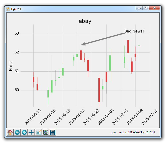
Depending on when you do this tutorial, a good spot to point to will differ, this is just an example of annotating something, with some reasonable idea of why we might annotate something.
When the chart is up, try clicking the pan button (the blue cross), and then move the chart around. You'll see that the text stays, but the arrow follows and continues to point to the exact point that we want. Pretty cool!
Full code for the last graph:
import matplotlib.pyplot as plt
import matplotlib.dates as mdates
import matplotlib.ticker as mticker
from matplotlib.finance import candlestick_ohlc
from matplotlib import style

import numpy as np
import urllib
import datetime as dt

style.use('fivethirtyeight')
print(plt.style.available)

print(plt.__file__)


def bytespdate2num(fmt, encoding='utf-8'):
    strconverter = mdates.strpdate2num(fmt)
    def bytesconverter(b):
        s = b.decode(encoding)
        return strconverter(s)
    return bytesconverter


def graph_data(stock):

    fig = plt.figure()
    ax1 = plt.subplot2grid((1,1), (0,0))

    stock_price_url = 'http://chartapi.finance.yahoo.com/instrument/1.0/'+stock+'/chartdata;type=quote;range=1m/csv'
    source_code = urllib.request.urlopen(stock_price_url).read().decode()
    stock_data = []
    split_source = source_code.split('\n')
    for line in split_source:
        split_line = line.split(',')
        if len(split_line) == 6:
            if 'values' not in line and 'labels' not in line:
                stock_data.append(line)


    date, closep, highp, lowp, openp, volume = np.loadtxt(stock_data,
                                                          delimiter=',',
                                                          unpack=True,
                                                          converters={0: bytespdate2num('%Y%m%d')})

    x = 0
    y = len(date)
    ohlc = []

    while x < y:
        append_me = date[x], openp[x], highp[x], lowp[x], closep[x], volume[x]
        ohlc.append(append_me)
        x+=1


    candlestick_ohlc(ax1, ohlc, width=0.4, colorup='#77d879', colordown='#db3f3f')

    for label in ax1.xaxis.get_ticklabels():
        label.set_rotation(45)

    ax1.xaxis.set_major_formatter(mdates.DateFormatter('%Y-%m-%d'))
    ax1.xaxis.set_major_locator(mticker.MaxNLocator(10))
    ax1.grid(True)
    ax1.annotate('Bad News!',(date[9],highp[9]),
                 xytext=(0.8, 0.9), textcoords='axes fraction',
                 arrowprops = dict(facecolor='grey',color='grey'))

##    # Text placement example:
##    font_dict = {'family':'serif',
##                 'color':'darkred',
##                 'size':15}
##    ax1.text(date[10], closep[1],'Text Example', fontdict=font_dict)

    plt.xlabel('Date')
    plt.ylabel('Price')
    plt.title(stock)
    #plt.legend()
    plt.subplots_adjust(left=0.09, bottom=0.20, right=0.94, top=0.90, wspace=0.2, hspace=0)
    plt.show()


graph_data('ebay')
Now, with annotations, we can do some other things, like annotating last price for stock charts. That's what we'll be doing next.
There exists 1 quiz/question(s) for this tutorial. for access to these, video downloads, and no ads.
-
Introduction to Matplotlib and basic line
-
Legends, Titles, and Labels with Matplotlib
-
Bar Charts and Histograms with Matplotlib
-
Scatter Plots with Matplotlib
-
Stack Plots with Matplotlib
-
Pie Charts with Matplotlib
-
Loading Data from Files for Matplotlib
-
Data from the Internet for Matplotlib
-
Converting date stamps for Matplotlib
-
Basic customization with Matplotlib
-
Unix Time with Matplotlib
-
Colors and Fills with Matplotlib
-
Spines and Horizontal Lines with Matplotlib
-
Candlestick OHLC graphs with Matplotlib
-
Styles with Matplotlib
-
Live Graphs with Matplotlib
-
Annotations and Text with Matplotlib
-
Annotating Last Price Stock Chart with Matplotlib
-
Subplots with Matplotlib
-
Implementing Subplots to our Chart with Matplotlib
-
More indicator data with Matplotlib
-
Custom fills, pruning, and cleaning with Matplotlib
-
Share X Axis, sharex, with Matplotlib
-
Multi Y Axis with twinx Matplotlib
-
Custom Legends with Matplotlib
-
Basemap Geographic Plotting with Matplotlib
-
Basemap Customization with Matplotlib
-
Plotting Coordinates in Basemap with Matplotlib
-
3D graphs with Matplotlib
-
3D Scatter Plot with Matplotlib
-
3D Bar Chart with Matplotlib
-
Conclusion with Matplotlib
