Matplotlib Crash Course Python Tutorial
One of the most popular uses for Python is data analysis. Naturally, data scientists want a way to visualize their data. Either they are wanting to see it for themselves to get a better grasp of the data, or they want to display the data to convey their results to someone. With Matplotlib, arguably the most popular graphing and data visualization module for Python, this is very simplistic to do. In this tutorial, I will be covering all of what I consider to be the basic necessities for Matplotlib. If you are interested in learning more about Matplotlib, then I highly suggest you visit my extensive and dedicated tutorial series on just Matplotlib.
In order to get the Matplotlib, you should first head to Matplotlib.org and download the version that matches your version of Python. From there, it'd be wise to go ahead and make sure you have pyparsing, dateutil, six, numpy, and maybe some of the others mentioned in the video. You can get all of these as well, if you are on a Windows machine by heading to: http://www.lfd.uci.edu/~gohlke/pythonlibs/#matplotlib
Once you have Matplotlib installed, be sure to open up a terminal or a script, type:
import matplotlib
Make sure there are no errors on the import. If there are, read the error. Most often, either the bit version does not match (64 bit vs 32 bit), or you are missing a package like dateutil or pyparsing.
Once you can successfully import matplotlib, then you are ready to continue.
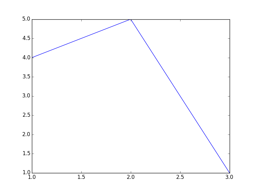
Here's some basic code to generating one of the most simple graphs that we can, it will take us only 3 lines.
#Importing pyplot
from matplotlib import pyplot as plt

#Plotting to our canvas
plt.plot([1,2,3],[4,5,1])

#Showing what we plotted
plt.show()
Resulting graph:
As you progress with Matplotlib, it might be useful to understand how it works fundamentally. This process is true with a lot of computer graphics processes. First, you have some data, then you "draw" that data to a canvas of some sort, but it is only in the computer's memory. Once you've drawn that data, you can then "show" that data. This is so the computer can first draw everything, and then perform the more laborious task of showing it on the screen.
So, with the code above, we just import pyplot from matplotlib, we use pyplot to "plot" some data to the canvas in memory, then we use plt, which is pyplot, to show what we've got.
Now, of course, there are some problems with our graph. First off, we learned in school that we're supposed to put labels on each axis and that we need a title to our graph or chart. Next, in terms of programming, it is unlikely that you will actually be filling in data to the plt.plot() function. Instead, you will, or at least you should, be only passing variables into it. Like plt.plot(x,y). So now let us show plotting variables as well as adding some descriptive labels and a good title!
from matplotlib import pyplot as plt

x = [5,8,10]
y = [12,16,6]

plt.plot(x,y)

plt.title('Epic Info')
plt.ylabel('Y axis')
plt.xlabel('X axis')

plt.show()
Our new graph:
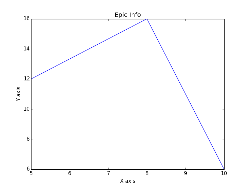
Great, now we have titles and labels, and we can see how easily we can plot variables.
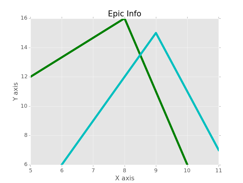
Next up, however, our graph is, well, ugly. If you want to learn all of the ins and outs to heavily customizing your graphs, then you will definitely want to check out the Matplotlib series referenced above. Here, my goal is to get you on your way as quick as possible with the basics. Making graphs look decent, however, is definitely important. With this in mind, I have decided to just share matplotlib styles with you. Styles work with matplotlib very much in the same way that CSS stylesheets work with HTML. You can just "import" a stylesheet and use all of the pre-set customizations of that stylesheet. This way, you can save them, and not need to code any style customizations yourself. Eventually, Styles will be built into your matplotlib installation. At the time of my writing this, they are not. This means we'll need to just do it ourselves, luckily, this is relatively easy. If you get lost in this process, then check out the video:
To get styles, head to: pythonprogramming.net/downloads/style.zip
Then, extract that, and move the styles folder within it to c:/python34/matplotlib, where python34 is your python version. If you are not on windows, just make sure the styles folder is in the root matplotlib package folder.
With that, we're ready to use styles. Be sure to poke around the styles files, to get a feel for how they work and maybe customize them yourself a bit if you like. From there, using them is simple enough:
from matplotlib import pyplot as plt
from matplotlib import style

style.use('ggplot')

x = [5,8,10]
y = [12,16,6]

x2 = [6,9,11]
y2 = [6,15,7]

# can plot specifically, after just showing the defaults:
plt.plot(x,y,linewidth=5)
plt.plot(x2,y2,linewidth=5)

plt.title('Epic Info')
plt.ylabel('Y axis')
plt.xlabel('X axis')

plt.show()
Here, as you can see, the only reference to styling that we've made is the style.use() function, as well as the line width changes. We could also change the line colors if we wanted, instead of using the default colors, and get a chart like:
I find it best to go ahead and import styles right away, then make any minor changes that I might want to make later in the script. If you call styles right at the end, you will wind up overwriting any customizing changes that you already made.
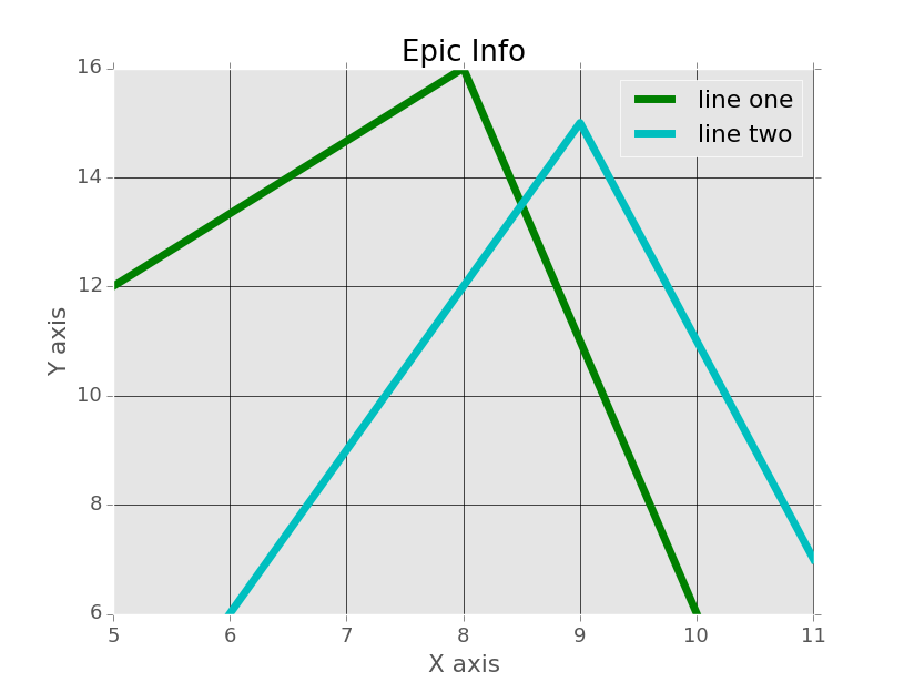
Now that we've got this, what more can we do? Well an obvious "basic" thing is legends. Let's add a legend to our chart, and, since it is simple enough, let's learn about grid lines too:
from matplotlib import pyplot as plt
from matplotlib import style

style.use('ggplot')

x = [5,8,10]
y = [12,16,6]

x2 = [6,9,11]
y2 = [6,15,7]
Up to this, everything is about the same, but now you can see we've added another parameter to our plt.plot(), which is "label." Just to clarify, for those who are not yet totally comfortable with the notion of default parameters in functions, some people may be curious about why we are able to plot the x, y, and color variable without any sort of assignment, but then we have to assign label and linewidth. The main reason here is because there are many parameters to pyplot.plot(). It is really easy to forget their order. X, y, and color is fairly easy to remember the order, people are good at remembering orders of three. After that, the chances of forgetting the proper order get quite high, so it just makes sense. There are also many parameters to edit, so we just call them specifically. Anyway, we can see here that we added a "label," so matplotlib knows what to call the line. This doesn't quite yet give us a legend, however. We need to call plt.legend(). It's important to call legend AFTER you've plotted what you want to be included in the legend.
plt.plot(x,y,'g',label='line one', linewidth=5)
plt.plot(x2,y2,'c',label='line two',linewidth=5)

plt.title('Epic Info')
plt.ylabel('Y axis')
plt.xlabel('X axis')

plt.legend()

plt.grid(True,color='k')

plt.show()
Okay, well that's good enough for linear charts I'd say. Keep in mind what I was saying about how matplotlib first "draws" things to a canvas, then finally shows it. Things like legends are drawn when you call them, so, if you are using, say, subplots, and call legends at the very end, only the 2nd subplot would have a legend. If you wanted a legend on each subplot, then you would need to call it per subplot. This is the same with titles! But hey, I didn't even cover subplots (multiple graphs on the same "figure," which just means the same window)... if you are curious about those, check out the in-depth Matplotlib tutorial series, or the specific matplotlib subplots tutorial.
On to bar charts and scatter plots!
Bar charts with matplotlib are basically 1 slight change, same with scatter plots. The only major change I like to make to bar charts is to center them, and that's about it:
from matplotlib import pyplot as plt
from matplotlib import style

style.use('ggplot')

x = [5,8,10]
y = [12,16,6]

x2 = [6,9,11]
y2 = [6,15,7]


plt.bar(x, y, align='center')

plt.bar(x2, y2, color='g', align='center')


plt.title('Epic Info')
plt.ylabel('Y axis')
plt.xlabel('X axis')

plt.show()
Result:
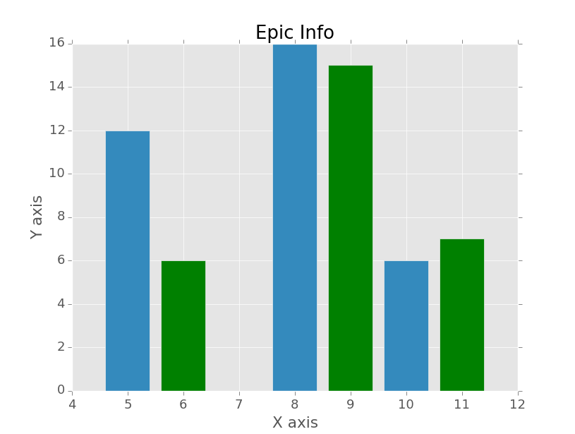
So, here, we can see instead of plt.plot(), we've used plt.bar(). We also used a new parameter called align, and made it align centered. I like that, you don't have to use it if you don't of course.
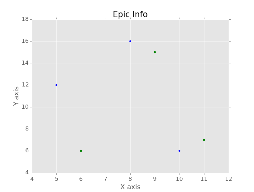
How about scatter plots? Super easy, we'll just change .bar() to .scatter(), and remove our align parameter:
from matplotlib import pyplot as plt
from matplotlib import style

style.use('ggplot')

x = [5,8,10]
y = [12,16,6]

x2 = [6,9,11]
y2 = [6,15,7]

plt.scatter(x, y)#, align='center')

plt.scatter(x2, y2, color='g')#, align='center')


plt.title('Epic Info')
plt.ylabel('Y axis')
plt.xlabel('X axis')

plt.show()
The result:
Great, so we're Matplotlib wizards now, and we're ready to journey into the real world and plot stuff! One of the more popular file types that you'll first start using is CSVs. Eventually, you'll probably find that people stop using CSV files and use either databases or they are using something like HDF5 formatting. For now, let's just cover CSV. There are obviously many ways to read files in Python. You can use Python's CSV module that is a part of the standard library. You can make use of Numpy's loadtxt as well, which we'll be using. Another fantastic choice is using Pandas! So there are many choices to consider, but, for now, we're going to use Numpy. Depending on your goals and requirements, you might eventually wind up choosing something else. I like NumPy because it's very open-ended for data analysis, yet still very powerful. I also think Pandas is going to be a great choice for most people, but it is less open-ended. Enough on that though. Make sure you have NumPy installed. If you do not:
https://pypi.python.org/pypi/numpyor
http://www.lfd.uci.edu/~gohlke/pythonlibs/#numpyOnce you have NumPy, you're going to need some sample data! Either grab some that you'd like to use if you think you are going to be able to make the necessary edits, or feel free to use this sample data:
Saved as "exampleFile.csv" in the root directory (the same directory) as your current script:
1,5
2,7
3,8
4,3
5,5
6,6
7,3
8,7
9,2
10,12
11,5
12,7
13,2
14,6
15,9
16,2
Save that, and then the code to plot from this data set:
from matplotlib import pyplot as plt
from matplotlib import style
import numpy as np

style.use('ggplot')

x,y = np.loadtxt('exampleFile.csv',
                 unpack=True,
                 delimiter = ',')

plt.plot(x,y)

plt.title('Epic Info')
plt.ylabel('Y axis')
plt.xlabel('X axis')

plt.show()
Result:
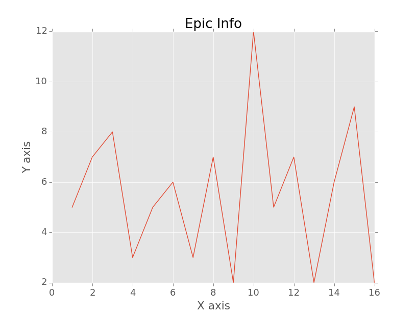
Here, our major new things are importing numpy, and then using numpy's loadtxt function. Loadtxt can be used to load more than just .txt files. It's just load things with text, that's all. Here, we are unpacking the contents of exampleFile.csv, using the delimiter of a comma. It's important to note here that you MUST unpack the exact same number of columns that will come from the delimiter that you state. If not, you'll get an error.
Whew! Quite the long page, but hopefully that was okay. If you have any questions or problems, be sure to leave a comment on the pertinent YouTube video. Hey, while you are there, you could also subscribe!
There exists 1 challenge(s) for this tutorial. for access to these, video downloads, and no ads.
Want more Data Visualization? :
Python 3 Basics next tutorial:
-
Matplotlib Crash Course
-
3D graphs in Matplotlib
-
3D Scatter Plot with Python and Matplotlib
-
More 3D scatter-plotting with custom colors
-
3D Barcharts
-
3D Plane wireframe Graph
-
Live Updating Graphs with Matplotlib Tutorial
-
Modify Data Granularity for Graphing Data
-
Geographical Plotting with Basemap and Python p. 1
-
Geographical Plotting with Basemap and Python p. 2
-
Geographical Plotting with Basemap and Python p. 3
-
Geographical Plotting with Basemap and Python p. 4
-
Geographical Plotting with Basemap and Python p. 5
-
Advanced Matplotlib Series (videos and ending source only)
-
Python Introduction
-
Print Function and Strings
-
Math with Python
-
Variables Python Tutorial
-
While Loop Python Tutorial
-
For Loop Python Tutorial
-
If Statement Python Tutorial
-
If Else Python Tutorial
-
If Elif Else Python Tutorial
-
Functions Python Tutorial
-
Function Parameters Python Tutorial
-
Function Parameter Defaults Python Tutorial
-
Global and Local Variables Python Tutorial
-
Installing Modules Python Tutorial
-
How to download and install Python Packages and Modules with Pip
-
Common Errors Python Tutorial
-
Writing to a File Python Tutorial
-
Appending Files Python Tutorial
-
Reading from Files Python Tutorial
-
Classes Python Tutorial
-
Frequently asked Questions Python Tutorial
-
Getting User Input Python Tutorial
-
Statistics Module Python Tutorial
-
Module import Syntax Python Tutorial
-
Making your own Modules Python Tutorial
-
Python Lists vs Tuples
-
List Manipulation Python Tutorial
-
Multi-dimensional lists Python Tutorial
-
Reading CSV files in Python
-
Try and Except Error handling Python Tutorial
-
Multi-Line printing Python Tutorial
-
Python dictionaries
-
Built in functions Python Tutorial
-
OS Module Python Tutorial
-
SYS module Python Tutorial
-
Python urllib tutorial for Accessing the Internet
-
Regular Expressions with re Python Tutorial
-
How to Parse a Website with regex and urllib Python Tutorial
-
Tkinter intro
-
Tkinter buttons
-
Tkinter event handling
-
Tkinter menu bar
-
Tkinter images, text, and conclusion
-
Threading module
-
CX_Freeze Python Tutorial
-
The Subprocess Module Python Tutorial
-
Matplotlib Crash Course Python Tutorial
-
Python ftplib Tutorial
-
Sockets with Python Intro
-
Simple Port Scanner with Sockets
-
Threaded Port Scanner
-
Binding and Listening with Sockets
-
Client Server System with Sockets
-
Python 2to3 for Converting Python 2 scripts to Python 3
-
Python Pickle Module for saving Objects by serialization
-
Eval Module with Python Tutorial
-
Exec with Python Tutorial
