More 3D scatter-plotting with custom colors
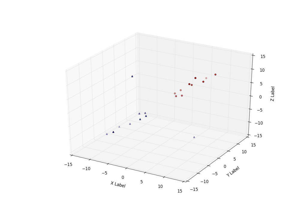
Sometimes people want to plot a scatter plot and compare different datasets to see if there is any similarities. Here, you are shown how to chart two sets of data and how to specifically mark them and color them differently.
The following sample code utilizes the Axes3D function of matplot3d in Matplotlib. We use two sample sets, each with their own X Y and Z data. From here, we use .scatter to plot them up, 'c' to reference color and 'marker' to reference the shape of the plot marker.
3D Matplotlib scatter plot code:
from mpl_toolkits.mplot3d import Axes3D
import matplotlib.pyplot as plt


fig = plt.figure()
ax = fig.add_subplot(111, projection='3d')

xs =[1,2,3,4,5,6,7,8,9,10]
ys =[5,6,2,3,13,4,1,2,4,8]
zs =[2,3,3,3,5,7,9,11,9,10]

xt =[-1,-2,-3,-4,-5,-6,-7,8,-9,-10]
yt =[-5,-6,-2,-3,-13,-4,-1,2,-4,-8]
zt =[-2,-3,-3,-3,-5,-7,9,-11,-9,-10]

ax.scatter(xs, ys, zs, c='r', marker='o')
ax.scatter(xt, yt, zt, c='b', marker='^')

ax.set_xlabel('X Label')
ax.set_ylabel('Y Label')
ax.set_zlabel('Z Label')

plt.show()
-
Matplotlib Crash Course
-
3D graphs in Matplotlib
-
3D Scatter Plot with Python and Matplotlib
-
More 3D scatter-plotting with custom colors
-
3D Barcharts
-
3D Plane wireframe Graph
-
Live Updating Graphs with Matplotlib Tutorial
-
Modify Data Granularity for Graphing Data
-
Geographical Plotting with Basemap and Python p. 1
-
Geographical Plotting with Basemap and Python p. 2
-
Geographical Plotting with Basemap and Python p. 3
-
Geographical Plotting with Basemap and Python p. 4
-
Geographical Plotting with Basemap and Python p. 5
-
Advanced Matplotlib Series (videos and ending source only)
