Basic stock data Manipulation - Python Programming for Finance p.3
Hello and welcome to part 3 of the Python for Finance tutorial series. In this tutorial, we're going to further break down some basic data manipulation and visualizations with our stock data. The starting code that we're going to be using (which was covered in the previous tutorial) is:
import datetime as dt
import matplotlib.pyplot as plt
from matplotlib import style
import pandas as pd
import pandas_datareader.data as web
style.use('ggplot')

df = pd.read_csv('tsla.csv', parse_dates=True, index_col=0)
The Pandas module comes equipped with a bunch of built-in functionality that you can leverage, along with ways to create custom Pandas functions. We'll cover some custom functions later, but, for now, let's do a very common operation to this data: Moving Averages.
The idea of a simple moving average is to take a window of time, and calculate the average price in that window. Then we shift that window over one period, and do it again. In our case, we'll do a 100 day rolling moving average. So this will take the current price, and the prices from the past 99 days, add them up, divide by 100, and there's your current 100-day moving average. Then we move the window over 1 day, and do the same thing again. Doing this in Pandas is as simple as:
df['100ma'] = df['Adj Close'].rolling(window=100).mean()
Doing df['100ma'] allows us to either re-define what comprises an existing column if we had one called '100ma,' or create a new one, which is what we're doing here. We're saying that the df['100ma'] column is equal to being the df['Adj Close'] column with a rolling method applied to it, with a window of 100, and this window is going to be a mean() (average) operation.
Now, we could do:
print(df.head())
                  Date       Open   High        Low      Close    Volume  \
Date
2010-06-29  2010-06-29  19.000000  25.00  17.540001  23.889999  18766300
2010-06-30  2010-06-30  25.790001  30.42  23.299999  23.830000  17187100
2010-07-01  2010-07-01  25.000000  25.92  20.270000  21.959999   8218800
2010-07-02  2010-07-02  23.000000  23.10  18.709999  19.200001   5139800
2010-07-06  2010-07-06  20.000000  20.00  15.830000  16.110001   6866900

            Adj Close  100ma
Date
2010-06-29  23.889999    NaN
2010-06-30  23.830000    NaN
2010-07-01  21.959999    NaN
2010-07-02  19.200001    NaN
2010-07-06  16.110001    NaN
What happened? Under the 100ma column we just see NaN. We chose a 100 moving average, which theoretically requires 100 prior datapoints to compute, so we wont have any data here for the first 100 rows. NaN means "Not a Number." With Pandas, you can decide to do lots of things with missing data, but, for now, let's actually just change the minimum periods parameter:
df['100ma'] = df['Adj Close'].rolling(window=100,min_periods=0).mean()
print(df.head())
                  Date       Open   High        Low      Close    Volume  \
Date
2010-06-29  2010-06-29  19.000000  25.00  17.540001  23.889999  18766300
2010-06-30  2010-06-30  25.790001  30.42  23.299999  23.830000  17187100
2010-07-01  2010-07-01  25.000000  25.92  20.270000  21.959999   8218800
2010-07-02  2010-07-02  23.000000  23.10  18.709999  19.200001   5139800
2010-07-06  2010-07-06  20.000000  20.00  15.830000  16.110001   6866900

            Adj Close      100ma
Date
2010-06-29  23.889999  23.889999
2010-06-30  23.830000  23.860000
2010-07-01  21.959999  23.226666
2010-07-02  19.200001  22.220000
2010-07-06  16.110001  20.998000
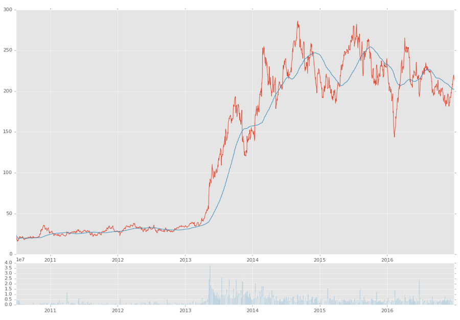
Alright, that worked, now we want to see it! But we've already seen simple graphs, how about something slightly more complex?
ax1 = plt.subplot2grid((6,1), (0,0), rowspan=5, colspan=1)
ax2 = plt.subplot2grid((6,1), (5,0), rowspan=1, colspan=1,sharex=ax1)
If you want to know more about subplot2grid, check out this subplots with Matplotlib tutorial.
Basically, we're saying we want to create two subplots, and both subplots are going to act like they're on a 6x1 grid, where we have 6 rows and 1 column. The first subplot starts at (0,0) on that grid, spans 5 rows, and spans 1 column. The next axis is also on a 6x1 grid, but it starts at (5,0), spans 1 row, and 1 column. The 2nd axis also has the sharex=ax1, which means that ax2 will always align its x axis with whatever ax1's is, and visa-versa. Now we just make our plots:
ax1.plot(df.index, df['Adj Close'])
ax1.plot(df.index, df['100ma'])
ax2.bar(df.index, df['Volume'])

plt.show()
Above, we've graphed the close and the 100ma on the first axis, and the volume on the 2nd axis. Our result:
Full code up to this point:
import datetime as dt
import matplotlib.pyplot as plt
from matplotlib import style
import pandas as pd
import pandas_datareader.data as web
style.use('ggplot')

df = pd.read_csv('tsla.csv', parse_dates=True, index_col=0)
df['100ma'] = df['Adj Close'].rolling(window=100, min_periods=0).mean()
print(df.head())

ax1 = plt.subplot2grid((6,1), (0,0), rowspan=5, colspan=1)
ax2 = plt.subplot2grid((6,1), (5,0), rowspan=1, colspan=1, sharex=ax1)

ax1.plot(df.index, df['Adj Close'])
ax1.plot(df.index, df['100ma'])
ax2.bar(df.index, df['Volume'])

plt.show()
In the next few tutorial, we'll learn how to make a candlestick graph via a Pandas resample of the data, and learn a bit more on working with Matplotlib.
-
Intro and Getting Stock Price Data - Python Programming for Finance p.1
-
Handling Data and Graphing - Python Programming for Finance p.2
-
Basic stock data Manipulation - Python Programming for Finance p.3
-
More stock manipulations - Python Programming for Finance p.4
-
Automating getting the S&P 500 list - Python Programming for Finance p.5
-
Getting all company pricing data in the S&P 500 - Python Programming for Finance p.6
-
Combining all S&P 500 company prices into one DataFrame - Python Programming for Finance p.7
-
Creating massive S&P 500 company correlation table for Relationships - Python Programming for Finance p.8
-
Preprocessing data to prepare for Machine Learning with stock data - Python Programming for Finance p.9
-
Creating targets for machine learning labels - Python Programming for Finance p.10 and 11
-
Machine learning against S&P 500 company prices - Python Programming for Finance p.12
-
Testing trading strategies with Quantopian Introduction - Python Programming for Finance p.13
-
Placing a trade order with Quantopian - Python Programming for Finance p.14
-
Scheduling a function on Quantopian - Python Programming for Finance p.15
-
Quantopian Research Introduction - Python Programming for Finance p.16
-
Quantopian Pipeline - Python Programming for Finance p.17
-
Alphalens on Quantopian - Python Programming for Finance p.18
-
Back testing our Alpha Factor on Quantopian - Python Programming for Finance p.19
-
Analyzing Quantopian strategy back test results with Pyfolio - Python Programming for Finance p.20
-
Strategizing - Python Programming for Finance p.21
-
Finding more Alpha Factors - Python Programming for Finance p.22
-
Combining Alpha Factors - Python Programming for Finance p.23
-
Portfolio Optimization - Python Programming for Finance p.24
-
Zipline Local Installation for backtesting - Python Programming for Finance p.25
-
Zipline backtest visualization - Python Programming for Finance p.26
-
Custom Data with Zipline Local - Python Programming for Finance p.27
-
Custom Markets Trading Calendar with Zipline (Bitcoin/cryptocurrency example) - Python Programming for Finance p.28
