Creating massive S&P 500 company correlation table for Relationships - Python Programming for Finance p.8
Hello and welcome to part 8 of the Python for Finance tutorial series. In the previous tutorial, we showed how to combine all of the daily pricing data for the S&P 500 companies. In this tutorial, we're going to see if we can find any interesting correlation data. To do this, we'd like to visualize it, since it's a lot of data. We're going to use Matplotlib for this, along with Numpy.
Full code up to this point:
import bs4 as bs
import datetime as dt
import os
import pandas as pd
import pandas_datareader.data as web
import pickle
import requests


def save_sp500_tickers():
    resp = requests.get('http://en.wikipedia.org/wiki/List_of_S%26P_500_companies')
    soup = bs.BeautifulSoup(resp.text, 'lxml')
    table = soup.find('table', {'class': 'wikitable sortable'})
    tickers = []
    for row in table.findAll('tr')[1:]:
        ticker = row.findAll('td')[0].text
        tickers.append(ticker)
    with open("sp500tickers.pickle", "wb") as f:
        pickle.dump(tickers, f)
    return tickers


# save_sp500_tickers()
def get_data_from_yahoo(reload_sp500=False):
    if reload_sp500:
        tickers = save_sp500_tickers()
    else:
        with open("sp500tickers.pickle", "rb") as f:
            tickers = pickle.load(f)
    if not os.path.exists('stock_dfs'):
        os.makedirs('stock_dfs')

    start = dt.datetime(2010, 1, 1)
    end = dt.datetime.now()
    for ticker in tickers:
        # just in case your connection breaks, we'd like to save our progress!
        if not os.path.exists('stock_dfs/{}.csv'.format(ticker)):
            df = web.DataReader(ticker, 'morningstar', start, end)
            df.reset_index(inplace=True)
            df.set_index("Date", inplace=True)
            df = df.drop("Symbol", axis=1)
            df.to_csv('stock_dfs/{}.csv'.format(ticker))
        else:
            print('Already have {}'.format(ticker))


def compile_data():
    with open("sp500tickers.pickle", "rb") as f:
        tickers = pickle.load(f)

    main_df = pd.DataFrame()

    for count, ticker in enumerate(tickers):
        df = pd.read_csv('stock_dfs/{}.csv'.format(ticker))
        df.set_index('Date', inplace=True)

        df.rename(columns={'Adj Close': ticker}, inplace=True)
        df.drop(['Open', 'High', 'Low', 'Close', 'Volume'], 1, inplace=True)

        if main_df.empty:
            main_df = df
        else:
            main_df = main_df.join(df, how='outer')

        if count % 10 == 0:
            print(count)
    print(main_df.head())
    main_df.to_csv('sp500_joined_closes.csv')


compile_data()
Now we're going to add the following imports and set a style:
import matplotlib.pyplot as plt
from matplotlib import style
import numpy as np

style.use('ggplot')
Next, we'll begin to build the visualization function:
def visualize_data():
    df = pd.read_csv('sp500_joined_closes.csv')
At this point, we could graph any company:
    df['AAPL'].plot()
    plt.show()
...But we didn't go through all that work to just graph single companies! Instead, let's look into the correlation of all of these companies. Building a correlation table in Pandas is actually unbelievably simple:
    df_corr = df.corr()
    print(df_corr.head())
That's seriously it. The .corr() automatically will look at the entire DataFrame, and determine the correlation of every column to every column. I've seen paid websites do exactly this as a service. So, if you need some side capital, there you have it!
We can of course save this if we want:
df_corr.to_csv('sp500corr.csv')
Instead, we're going to graph it. To do this, we're going to make a heatmap. There isn't a super simple heat map built into Matplotlib, but we have the tools to make on anyway. To do this, first we need the actual data itself to graph:
data1 = df_corr.values
This will give us a numpy array of just the values, which are the correlation numbers. Next, we'll build our figure and axis:
    fig1 = plt.figure()
    ax1 = fig1.add_subplot(111)
Now, we create the heatmap using pcolor:
heatmap1 = ax1.pcolor(data1, cmap=plt.cm.RdYlGn)
This heatmap is made using a range of colors, which can be a range of anything to anything, and the color scale is generated from the cmap that we use. You can find all of the options for color maps here. We're going to use RdYlGn, which is a colormap that goes from red on the low side, yellow for the middle, and green for the higher part of the scale, which will give us red for negative correlations, green for positive correlations, and yellow for no-correlations. We'll add a side-bar that is a colorbar as a sort of "scale" for us:
fig1.colorbar(heatmap1)
Next, we're going to set our x and y axis ticks so we know which companies are which, since right now we've only just plotted the data:
    ax1.set_xticks(np.arange(data1.shape[1]) + 0.5, minor=False)
    ax1.set_yticks(np.arange(data1.shape[0]) + 0.5, minor=False)
What this does is simply create tick markers for us. We don't yet have any labels.
Now we add:
    ax1.invert_yaxis()
    ax1.xaxis.tick_top()
This will flip our yaxis, so that the graph is a little easier to read, since there will be some space between the x's and y's. Generally matplotlib leaves room on the extreme ends of your graph since this tends to make graphs easier to read, but, in our case, it doesn't. Then we also flip the xaxis to be at the top of the graph, rather than the traditional bottom, again to just make this more like a correlation table should be. Now we're actually going to add the company names to the currently-nameless ticks:
    column_labels = df_corr.columns
    row_labels = df_corr.index
    ax1.set_xticklabels(column_labels)
    ax1.set_yticklabels(row_labels)
In this case, we could have used the exact same list from both sides, since column_labels and row_lables should be identical lists. This wont always be true for all heatmaps, however, so I decided to show this as the proper method for just about any heatmap from a dataframe. Finally:
    plt.xticks(rotation=90)
    heatmap1.set_clim(-1,1)
    plt.tight_layout()
    #plt.savefig("correlations.png", dpi = (300))
    plt.show()
We rotate the xticks, which are the actual tickers themselves, since normally they'll be written out horizontally. We've got over 500 labels here, so we're going to rotate them 90 degrees so they're vertical. It's still a graph that's going to be far too large to really see everything zoomed out, but that's fine. The line that says heatmap1.set_clim(-1,1) just tells the colormap that our range is going to be from -1 to positive 1. It should already be the case, but we want to be certain. Without this line, it should still be the min and max of your dataset, so it would have been pretty close anyway.
So we're done! The function up to this point:
def visualize_data():
    df = pd.read_csv('sp500_joined_closes.csv')
    #df['AAPL'].plot()
    #plt.show()
    df_corr = df.corr()
    print(df_corr.head())
    df_corr.to_csv('sp500corr.csv')

    data1 = df_corr.values
    fig1 = plt.figure()
    ax1 = fig1.add_subplot(111)

    heatmap1 = ax1.pcolor(data1, cmap=plt.cm.RdYlGn)
    fig1.colorbar(heatmap1)

    ax1.set_xticks(np.arange(data1.shape[1]) + 0.5, minor=False)
    ax1.set_yticks(np.arange(data1.shape[0]) + 0.5, minor=False)
    ax1.invert_yaxis()
    ax1.xaxis.tick_top()
    column_labels = df_corr.columns
    row_labels = df_corr.index
    ax1.set_xticklabels(column_labels)
    ax1.set_yticklabels(row_labels)
    plt.xticks(rotation=90)
    heatmap1.set_clim(-1,1)
    plt.tight_layout()
    #plt.savefig("correlations.png", dpi = (300))
    plt.show()

visualize_data()
And the full code up to this point:
import bs4 as bs
import datetime as dt
import matplotlib.pyplot as plt
from matplotlib import style
import numpy as np
import os
import pandas as pd
import pandas_datareader.data as web
import pickle
import requests

style.use('ggplot')


def save_sp500_tickers():
    resp = requests.get('http://en.wikipedia.org/wiki/List_of_S%26P_500_companies')
    soup = bs.BeautifulSoup(resp.text, 'lxml')
    table = soup.find('table', {'class': 'wikitable sortable'})
    tickers = []
    for row in table.findAll('tr')[1:]:
        ticker = row.findAll('td')[0].text
        tickers.append(ticker)
    with open("sp500tickers.pickle", "wb") as f:
        pickle.dump(tickers, f)
    return tickers


# save_sp500_tickers()
def get_data_from_yahoo(reload_sp500=False):
    if reload_sp500:
        tickers = save_sp500_tickers()
    else:
        with open("sp500tickers.pickle", "rb") as f:
            tickers = pickle.load(f)
    if not os.path.exists('stock_dfs'):
        os.makedirs('stock_dfs')

    start = dt.datetime(2010, 1, 1)
    end = dt.datetime.now()
    for ticker in tickers:
        # just in case your connection breaks, we'd like to save our progress!
        if not os.path.exists('stock_dfs/{}.csv'.format(ticker)):
            df = web.DataReader(ticker, 'morningstar', start, end)
            df.reset_index(inplace=True)
            df.set_index("Date", inplace=True)
            df = df.drop("Symbol", axis=1)
            df.to_csv('stock_dfs/{}.csv'.format(ticker))
        else:
            print('Already have {}'.format(ticker))


def compile_data():
    with open("sp500tickers.pickle", "rb") as f:
        tickers = pickle.load(f)

    main_df = pd.DataFrame()

    for count, ticker in enumerate(tickers):
        df = pd.read_csv('stock_dfs/{}.csv'.format(ticker))
        df.set_index('Date', inplace=True)

        df.rename(columns={'Adj Close': ticker}, inplace=True)
        df.drop(['Open', 'High', 'Low', 'Close', 'Volume'], 1, inplace=True)

        if main_df.empty:
            main_df = df
        else:
            main_df = main_df.join(df, how='outer')

        if count % 10 == 0:
            print(count)
    print(main_df.head())
    main_df.to_csv('sp500_joined_closes.csv')


def visualize_data():
    df = pd.read_csv('sp500_joined_closes.csv')
    df_corr = df.corr()
    print(df_corr.head())
    df_corr.to_csv('sp500corr.csv')
    data1 = df_corr.values
    fig1 = plt.figure()
    ax1 = fig1.add_subplot(111)

    heatmap1 = ax1.pcolor(data1, cmap=plt.cm.RdYlGn)
    fig1.colorbar(heatmap1)

    ax1.set_xticks(np.arange(data1.shape[1]) + 0.5, minor=False)
    ax1.set_yticks(np.arange(data1.shape[0]) + 0.5, minor=False)
    ax1.invert_yaxis()
    ax1.xaxis.tick_top()
    column_labels = df_corr.columns
    row_labels = df_corr.index
    ax1.set_xticklabels(column_labels)
    ax1.set_yticklabels(row_labels)
    plt.xticks(rotation=90)
    heatmap1.set_clim(-1, 1)
    plt.tight_layout()
    plt.show()


visualize_data()
The fruits of our labor:
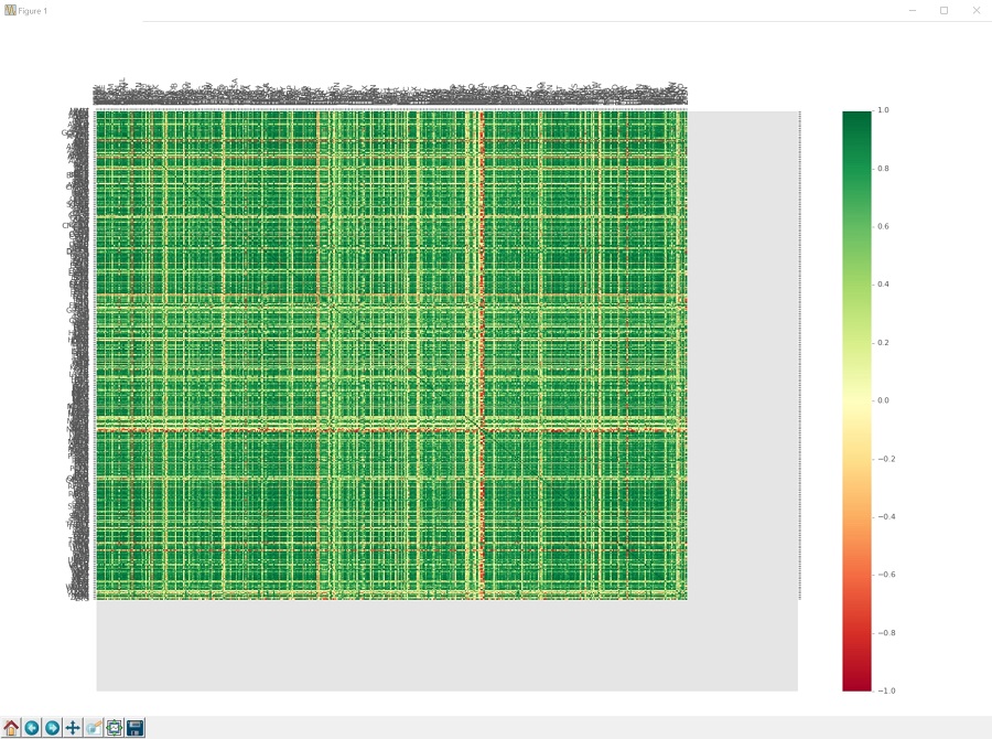
Wow, that's a lot of fruit.
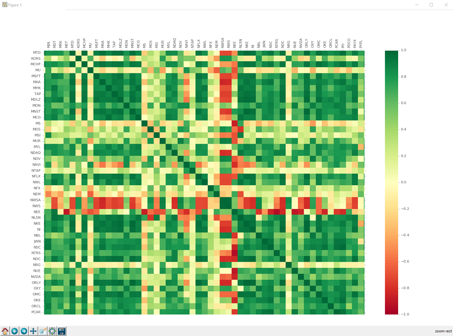
So we can zoom in using the magnifying glass:

If you click that, you can then click and drag a box that you want to zoom into. It will be hard to see the box on this graph, just know it's there. Click, drag, release, and you should zoom in, seeing something like:
You can move around from here, using the crossed-arrows button:
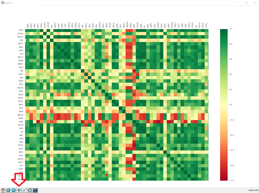
You can also get back to the original, full graph by clicking on the home looking button. You can also go "forward" and "backward" to previous views using the forward and back buttons. You can save it by clicking on the floppy-disk. I wonder how much longer we'll be using images of floppy-disks to depict saving things. How long until people have absolutely no idea what those even are?
Okay, so looking at the correlations, we can see that there are many relationships. The majority of companies are, unsurprisingly, positively correlated. There are quite a few companies that are very strongly correlated with eachother, and there are still quite a few that are very negatively correlated. There are even some companies that are negatively correlated with most companies. We can also see there are many companies with no correlation at all. Chances are, investing in a bunch of companies with zero correlation over time would be a decent way to be diverse, but we really don't know at this point.
Regardless, this data clearly has a lot of relationships already. One must wonder if a machine could recognize and trade based purely on these relationships. Could we be millionairs that easily?! We can at least try!
-
Intro and Getting Stock Price Data - Python Programming for Finance p.1
-
Handling Data and Graphing - Python Programming for Finance p.2
-
Basic stock data Manipulation - Python Programming for Finance p.3
-
More stock manipulations - Python Programming for Finance p.4
-
Automating getting the S&P 500 list - Python Programming for Finance p.5
-
Getting all company pricing data in the S&P 500 - Python Programming for Finance p.6
-
Combining all S&P 500 company prices into one DataFrame - Python Programming for Finance p.7
-
Creating massive S&P 500 company correlation table for Relationships - Python Programming for Finance p.8
-
Preprocessing data to prepare for Machine Learning with stock data - Python Programming for Finance p.9
-
Creating targets for machine learning labels - Python Programming for Finance p.10 and 11
-
Machine learning against S&P 500 company prices - Python Programming for Finance p.12
-
Testing trading strategies with Quantopian Introduction - Python Programming for Finance p.13
-
Placing a trade order with Quantopian - Python Programming for Finance p.14
-
Scheduling a function on Quantopian - Python Programming for Finance p.15
-
Quantopian Research Introduction - Python Programming for Finance p.16
-
Quantopian Pipeline - Python Programming for Finance p.17
-
Alphalens on Quantopian - Python Programming for Finance p.18
-
Back testing our Alpha Factor on Quantopian - Python Programming for Finance p.19
-
Analyzing Quantopian strategy back test results with Pyfolio - Python Programming for Finance p.20
-
Strategizing - Python Programming for Finance p.21
-
Finding more Alpha Factors - Python Programming for Finance p.22
-
Combining Alpha Factors - Python Programming for Finance p.23
-
Portfolio Optimization - Python Programming for Finance p.24
-
Zipline Local Installation for backtesting - Python Programming for Finance p.25
-
Zipline backtest visualization - Python Programming for Finance p.26
-
Custom Data with Zipline Local - Python Programming for Finance p.27
-
Custom Markets Trading Calendar with Zipline (Bitcoin/cryptocurrency example) - Python Programming for Finance p.28
