More stock manipulations - Python Programming for Finance p.4
Hello and welcome to part 4 of the Python for Finance tutorial series. In this tutorial, we're going to create a candlestick / OHLC graph based on the Adj Close column, which will allow me to cover resampling and a few more data visualization concepts.
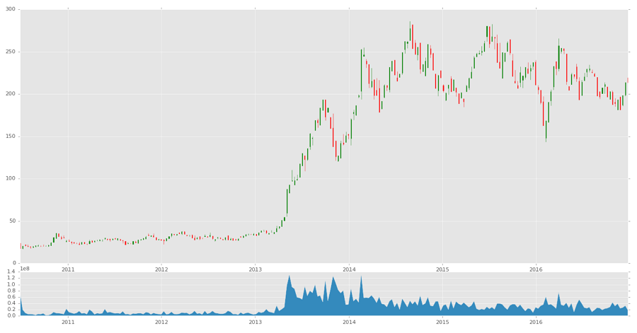
An OHLC chart, called a candlestick chart, is a chart that condenses the open, high, low, and close data all in one nice format. Plus it makes pretty colors, and remember what I told you about good looking charts?
Starting code that's been covered up to this point in previous tutorials:
import datetime as dt
import matplotlib.pyplot as plt
from matplotlib import style
import pandas as pd
import pandas_datareader.data as web
style.use('ggplot')

df = pd.read_csv('tsla.csv', parse_dates=True, index_col=0)
Unfortunately, making candlestick graphs right from Pandas isn't built in, even though creating OHLC data is. One day, I am sure this graph type will be made available, but, today, it isn't. That's alright though, we'll make it happen! First, we need to make two new imports:
from matplotlib.finance import candlestick_ohlc
import matplotlib.dates as mdates
The first import is the OHLC graph type from matplotlib, and the second import is the special mdates type that...is mostly just a pain in the butt, but that's the date type for matplotlib graphs. Pandas automatically handles that for you, but, like I said, we don't have that luxury yet with candlesticks.
First, we need proper OHLC data. Our current data does have OHLC values, and, unless I am mistaken, Tesla has never had a split, but you wont always be this lucky. Thus, we're going to create our own OHLC data, which will also allow us to show another data transformation that comes from Pandas:
df_ohlc = df['Adj Close'].resample('10D').ohlc()
What we've done here is created a new dataframe, based on the df['Adj Close']column, resamped with a 10 day window, and the resampling is an ohlc (open high low close). We could also do things like .mean() or .sum() for 10 day averages, or 10 day sums. Keep in mind, this 10 day average would be a 10 day average, not a rolling average. Since our data is daily data, resampling it to 10day data effectively shrinks the size of our data significantly. This is how you can normalize multiple datasets. Sometimes, you might have data that tracks once a month on the 1st of the month, other data that logs at the end of each month, and finally some data that logs weekly. You can resample this dataframe to the end of the month, every month, and effectively normalize it all! That's a more advanced Pandas feature that you can learn more about from the Pandas series if you like.
We'd like to graph both the candlestick data, as well as the volume data. We don't HAVE to resample the volume data, but we should, since it would be too granular compared to our 10D pricing data.
df_volume = df['Volume'].resample('10D').sum()
We're using sum here, since we really want to know the total volume traded over those 10 days, but you could also use mean instead. Now if we do:
print(df_ohlc.head())
We get:
                 open       high        low      close
Date
2010-06-29  23.889999  23.889999  15.800000  17.459999
2010-07-09  17.400000  20.639999  17.049999  20.639999
2010-07-19  21.910000  21.910000  20.219999  20.719999
2010-07-29  20.350000  21.950001  19.590000  19.590000
2010-08-08  19.600000  19.600000  17.600000  19.150000
That's expected, but, we want to now move this information to matplotlib, as well as convert the dates to the mdates version. Since we're just going to graph the columns in Matplotlib, we actually don't want the date to be an index anymore, so we can do:
df_ohlc = df_ohlc.reset_index()
Now dates is just a regular column. Next, we want to convert it:
df_ohlc['Date'] = df_ohlc['Date'].map(mdates.date2num)
Now we're going to setup the figure:
fig = plt.figure()
ax1 = plt.subplot2grid((6,1), (0,0), rowspan=5, colspan=1)
ax2 = plt.subplot2grid((6,1), (5,0), rowspan=1, colspan=1,sharex=ax1)
ax1.xaxis_date()
Everything here you've already seen, except ax1.xaxis_date(). What this does for us is converts the axis from the raw mdate numbers to dates.
Now we can graph the candlestick graph:
candlestick_ohlc(ax1, df_ohlc.values, width=2, colorup='g')
Then do volume:
ax2.fill_between(df_volume.index.map(mdates.date2num),df_volume.values,0)
The fill_between function will graph x, y, then what to fill to/between. In our case, we're choosing 0.
plt.show()
Full code for this tutorial:
import datetime as dt
import matplotlib.pyplot as plt
from matplotlib import style
from matplotlib.finance import candlestick_ohlc
import matplotlib.dates as mdates
import pandas as pd
import pandas_datareader.data as web
style.use('ggplot')

df = pd.read_csv('tsla.csv', parse_dates=True, index_col=0)

df_ohlc = df['Adj Close'].resample('10D').ohlc()
df_volume = df['Volume'].resample('10D').sum()

df_ohlc.reset_index(inplace=True)
df_ohlc['Date'] = df_ohlc['Date'].map(mdates.date2num)

ax1 = plt.subplot2grid((6,1), (0,0), rowspan=5, colspan=1)
ax2 = plt.subplot2grid((6,1), (5,0), rowspan=1, colspan=1, sharex=ax1)
ax1.xaxis_date()

candlestick_ohlc(ax1, df_ohlc.values, width=5, colorup='g')
ax2.fill_between(df_volume.index.map(mdates.date2num), df_volume.values, 0)
plt.show()
In the next few tutorials, we're going to leave the visualization bits behind for a bit while we focus on acquiring data and dealing with it.
-
Intro and Getting Stock Price Data - Python Programming for Finance p.1
-
Handling Data and Graphing - Python Programming for Finance p.2
-
Basic stock data Manipulation - Python Programming for Finance p.3
-
More stock manipulations - Python Programming for Finance p.4
-
Automating getting the S&P 500 list - Python Programming for Finance p.5
-
Getting all company pricing data in the S&P 500 - Python Programming for Finance p.6
-
Combining all S&P 500 company prices into one DataFrame - Python Programming for Finance p.7
-
Creating massive S&P 500 company correlation table for Relationships - Python Programming for Finance p.8
-
Preprocessing data to prepare for Machine Learning with stock data - Python Programming for Finance p.9
-
Creating targets for machine learning labels - Python Programming for Finance p.10 and 11
-
Machine learning against S&P 500 company prices - Python Programming for Finance p.12
-
Testing trading strategies with Quantopian Introduction - Python Programming for Finance p.13
-
Placing a trade order with Quantopian - Python Programming for Finance p.14
-
Scheduling a function on Quantopian - Python Programming for Finance p.15
-
Quantopian Research Introduction - Python Programming for Finance p.16
-
Quantopian Pipeline - Python Programming for Finance p.17
-
Alphalens on Quantopian - Python Programming for Finance p.18
-
Back testing our Alpha Factor on Quantopian - Python Programming for Finance p.19
-
Analyzing Quantopian strategy back test results with Pyfolio - Python Programming for Finance p.20
-
Strategizing - Python Programming for Finance p.21
-
Finding more Alpha Factors - Python Programming for Finance p.22
-
Combining Alpha Factors - Python Programming for Finance p.23
-
Portfolio Optimization - Python Programming for Finance p.24
-
Zipline Local Installation for backtesting - Python Programming for Finance p.25
-
Zipline backtest visualization - Python Programming for Finance p.26
-
Custom Data with Zipline Local - Python Programming for Finance p.27
-
Custom Markets Trading Calendar with Zipline (Bitcoin/cryptocurrency example) - Python Programming for Finance p.28
