3D Scatter Plot with Python and Matplotlib
Besides 3D wires, and planes, one of the most popular 3-dimensional graph types is 3D scatter plots. The idea of 3D scatter plots is that you can compare 3 characteristics of a data set instead of two.
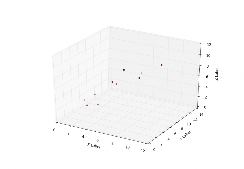
This tutorial covers how to do just that with some simple sample data. Here is the code that generates a basic 3D scatter plot that goes with the video tutorial:
from mpl_toolkits.mplot3d import Axes3D
import matplotlib.pyplot as plt


fig = plt.figure()
ax = fig.add_subplot(111, projection='3d')

x =[1,2,3,4,5,6,7,8,9,10]
y =[5,6,2,3,13,4,1,2,4,8]
z =[2,3,3,3,5,7,9,11,9,10]


ax.scatter(x, y, z, c='r', marker='o')

ax.set_xlabel('X Label')
ax.set_ylabel('Y Label')
ax.set_zlabel('Z Label')

plt.show()
-
Matplotlib Crash Course
-
3D graphs in Matplotlib
-
3D Scatter Plot with Python and Matplotlib
-
More 3D scatter-plotting with custom colors
-
3D Barcharts
-
3D Plane wireframe Graph
-
Live Updating Graphs with Matplotlib Tutorial
-
Modify Data Granularity for Graphing Data
-
Geographical Plotting with Basemap and Python p. 1
-
Geographical Plotting with Basemap and Python p. 2
-
Geographical Plotting with Basemap and Python p. 3
-
Geographical Plotting with Basemap and Python p. 4
-
Geographical Plotting with Basemap and Python p. 5
-
Advanced Matplotlib Series (videos and ending source only)
