3D Barcharts
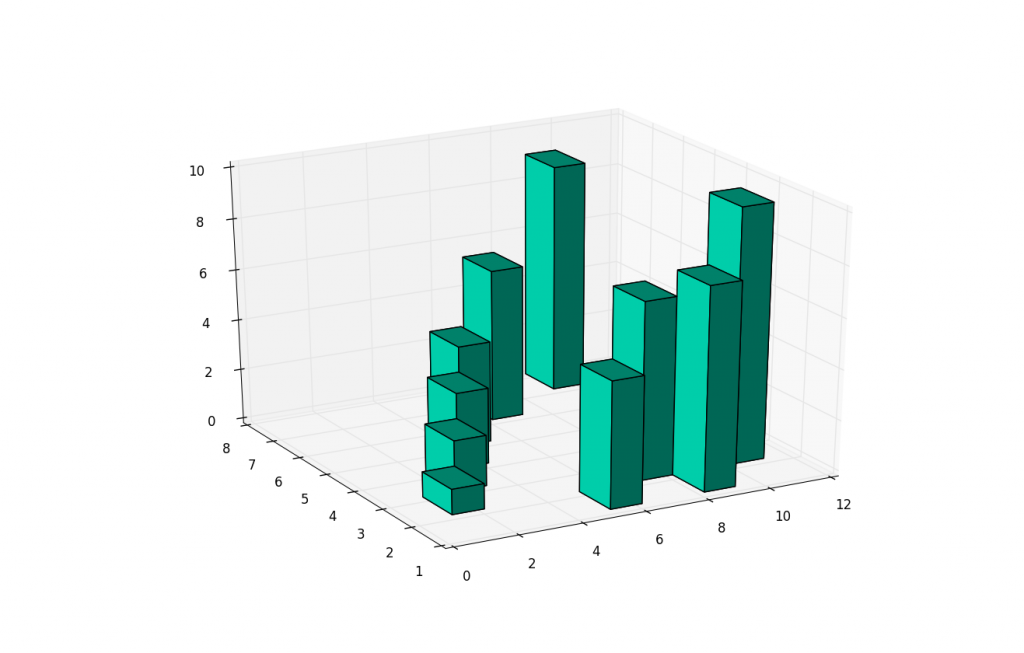
Besides 3D scatter plots, we can also do 3D bar charts. This again allows us to compare the relationship of three variables rather than just two. 3D bar charts with matplotlib are slightly more complex than your scatter plots, because the bars have 1 more characteristic: depth. Basically, the "thickness" of the bars is also define-able. For most, this will be simply a pre-determined set of data, but you can actually use this for one more "dimension" to your plot.
Here is the sample code for the 3D bar charts:
from mpl_toolkits.mplot3d import Axes3D
import matplotlib.pyplot as plt
import numpy as np

fig = plt.figure()
ax1 = fig.add_subplot(111, projection='3d')

xpos = [1,2,3,4,5,6,7,8,9,10]
ypos = [2,3,4,5,1,6,2,1,7,2]
num_elements = len(xpos)
zpos = [0,0,0,0,0,0,0,0,0,0]
dx = np.ones(10)
dy = np.ones(10)
dz = [1,2,3,4,5,6,7,8,9,10]

ax1.bar3d(xpos, ypos, zpos, dx, dy, dz, color='#00ceaa')
plt.show()
-
Matplotlib Crash Course
-
3D graphs in Matplotlib
-
3D Scatter Plot with Python and Matplotlib
-
More 3D scatter-plotting with custom colors
-
3D Barcharts
-
3D Plane wireframe Graph
-
Live Updating Graphs with Matplotlib Tutorial
-
Modify Data Granularity for Graphing Data
-
Geographical Plotting with Basemap and Python p. 1
-
Geographical Plotting with Basemap and Python p. 2
-
Geographical Plotting with Basemap and Python p. 3
-
Geographical Plotting with Basemap and Python p. 4
-
Geographical Plotting with Basemap and Python p. 5
-
Advanced Matplotlib Series (videos and ending source only)
