Pandas Basics
Code written in Python 2, but you can either comment out all print statements, or convert them to functions and it will work fine.
import datetime
import pandas as pd
import pandas.io.data
from pandas import DataFrame
import matplotlib.pyplot as plt
from matplotlib import style
style.use('ggplot')
## grabbing from yahoo finance ###
sp500 = pd.io.data.get_data_yahoo('%5EGSPC',
start=datetime.datetime(2000, 10, 1),
end=datetime.datetime(2012, 1, 1))
print sp500.head()
# saving to a csv #
sp500.to_csv('sp500_ohlc.csv')
# reading from the csv #
df = pd.read_csv('sp500_ohlc.csv', index_col='Date', parse_dates=True)
df.head()
print df.index
# again, just accessing a column.... #
ts = df['Close'][-10:]
print ts
# or a couple:
print df[['Open', 'Close']].head()
# can also create new columns:
df['H-L'] = df.High - df.Low
print df.head()
# can also delete:
del df['H-L']
print df.head()
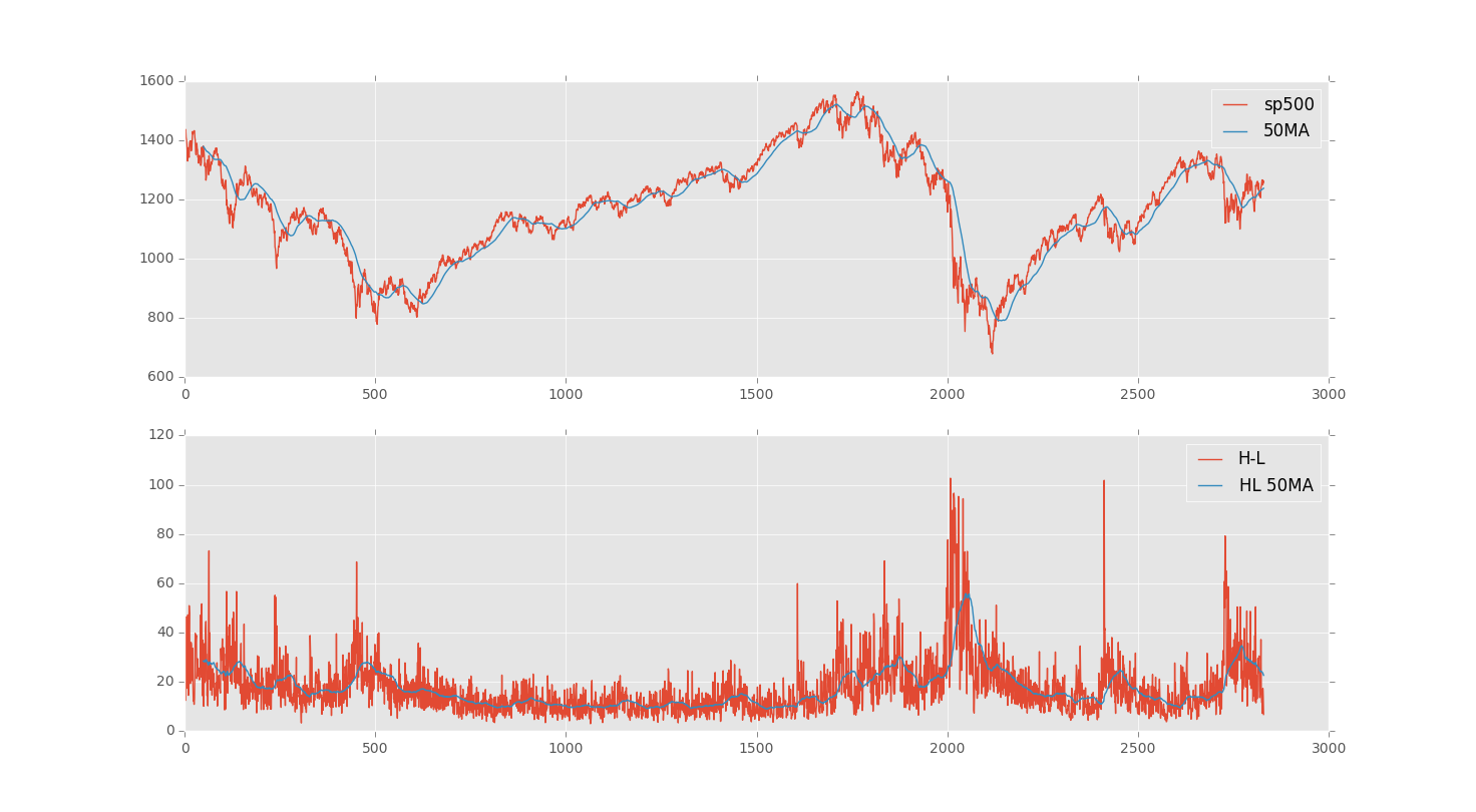
#So besides High minus low, people like to see moving averages:
close = df['Adj Close']
ma = pd.rolling_mean(close, 50)
print ma[-10:]
#so then let's bring back the high minus low, since ppl like to use that
#sometimes.
# can also create new columns:
df['H-L'] = df.High - df.Low
HLMA = pd.rolling_mean(df['H-L'], 50)
print df.head()
ax1 = plt.subplot(2, 1, 1)
ax1.plot(close, label='sp500')
ax1.plot(ma, label='50MA')
plt.legend()
ax2 = plt.subplot(2, 1, 2, sharex = ax1)
ax2.plot(df['H-L'], label='H-L')
ax2.plot(HLMA, label='HL 50MA')
plt.legend()
plt.show()
