Dynamic Graph based on User Input - Data Visualization GUIs with Dash and Python p.3
Welcome to part three of the web-based data visualization with Dash tutorial series. Up to this point, we've learned how to make a simple graph and how to dynamically update HTML elements in real-time without a page refresh. While we were just re-outputting the same text as we input, we can also apply some more logic to the input, and output anything, not just text, such as a graph. That's what we're going to do here.
I am going to have us use Pandas, and we'll grab some stock information, but you can use whatever you want. Any time I do examples with finance, people complain because they don't understand finance. It's just dates and values. You don't need to read too deep into it, I promise! To follow along exactly, you'll need pandas and pandas-datareader. Grab them:
pip install --upgrade pandas pandas-datareader
You already know everything you need to know to do all of this, except you may not have seen how to get data from pandas' datareader. Let's do that real quick:
import datetime
import pandas_datareader.data as web

start = datetime.datetime(2015, 1, 1)
end = datetime.datetime.now()
df = web.DataReader("TSLA", 'morningstar', start, end)
df.reset_index(inplace=True)
df.set_index("Date", inplace=True)
df = df.drop("Symbol", axis=1)

print(df.head())
Output:
              Open    High     Low   Close   Volume
Date
2015-01-02  222.87  223.25  213.26  219.31  4764443
2015-01-05  214.55  216.50  207.16  210.09  5368477
2015-01-06  210.06  214.20  204.21  211.28  6261936
2015-01-07  213.35  214.78  209.78  210.95  2968390
2015-01-08  212.81  213.80  210.01  210.62  3442509
You may get a warning about Google Finance being unreliable, or maybe we've reached the end of the road with Google finance. If it's just a warning, ignore it, otherwise check out some place like Quandl, and feel free to email me, I can update this code use some other source.
That's it! Give it a symbol to pull data on, from what source you want to pull it from, a starting datetime, an ending datetime, and you're all set. The return is a Pandas dataframe. If you're not familiar with Pandas, it basically returns data in table-form. Think of it like Microsoft Excel, but for Python. If you want to learn more, you can check out the Data Analysis with Python and Pandas tutorials.
So, we've seen how to make a basic graph already:
import dash
import dash_core_components as dcc
import dash_html_components as html

app = dash.Dash()

app.layout = html.Div(children=[
    html.H1(children='Hello Dash'),


    html.Div(children='''
        Dash: A web application framework for Python.
    '''),

    dcc.Graph(
        id='example-graph',
        figure={
            'data': [
                {'x': [1, 2, 3], 'y': [4, 1, 2], 'type': 'line', 'name': 'SF'},
                {'x': [1, 2, 3], 'y': [2, 4, 5], 'type': 'bar', 'name': u'Montréal'},
            ],
            'layout': {
                'title': 'Dash Data Visualization'
            }
        }
    )
])

if __name__ == '__main__':
    app.run_server(debug=True)
All we need to do is basically just replace the x and y values with whatever we want this time. Easy enough, starting from the basic graph code above, we need to bring in the pandas imports:
import pandas_datareader.data as web
import datetime
Next, let's bring in the stock info:
stock = 'TSLA'

start = datetime.datetime(2015, 1, 1)
end = datetime.datetime(2018, 2, 8)

df = web.DataReader(stock, 'morningstar', start, end)
df.reset_index(inplace=True)
df.set_index("Date", inplace=True)
df = df.drop("Symbol", axis=1)
Now, inside of the app.layout, let's modify the data parts:
{'x': df.index, 'y': df.Close, 'type': 'line', 'name': stock},
I also took the liberty to change the name and title to the specific stock. Full code up to this point:
import pandas_datareader.data as web
import datetime
import dash
import dash_core_components as dcc
import dash_html_components as html
app = dash.Dash()
stock = 'TSLA'
start = datetime.datetime(2015, 1, 1)
end = datetime.datetime(2018, 2, 8)
df = web.DataReader(stock, 'morningstar', start, end)
df.reset_index(inplace=True)
df.set_index("Date", inplace=True)
df = df.drop("Symbol", axis=1)
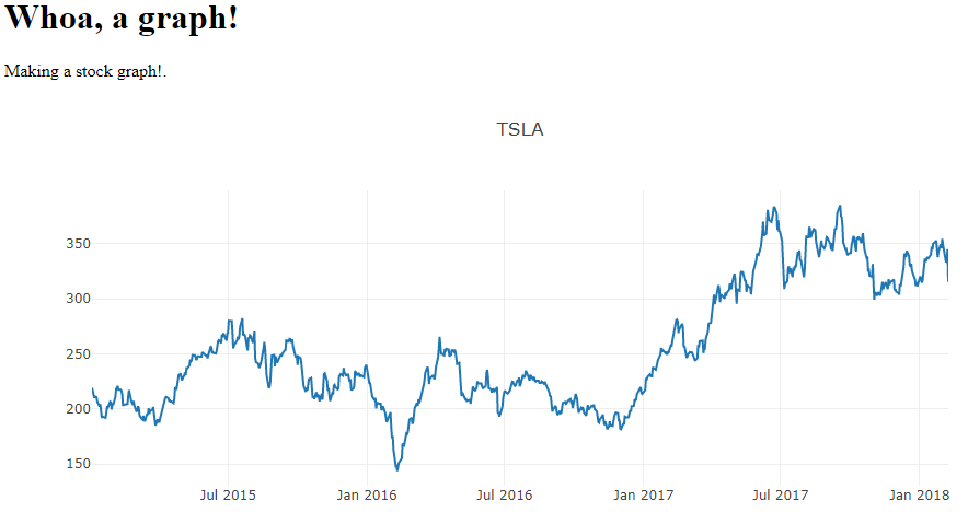
app.layout = html.Div(children=[
html.H1(children='Whoa, a graph!'),
html.Div(children='''
Making a stock graph!.
'''),
dcc.Graph(
id='example-graph',
figure={
'data': [
{'x': df.index, 'y': df.Close, 'type': 'line', 'name': stock},
],
'layout': {
'title': stock
}
}
)
])
if __name__ == '__main__':
app.run_server(debug=True)
The result here:
Okay, and finally, let's bring in that input field, and, instead of making the output just some text, let's make the output the graph itself!
Importing everything we need, setting the app, and describing the layout:
import pandas_datareader.data as web
import datetime
import dash
import dash_core_components as dcc
import dash_html_components as html
from dash.dependencies import Input, Output

app = dash.Dash()

app.layout = html.Div(children=[
    html.Div(children='''
        Symbol to graph:
    '''),
    dcc.Input(id='input', value='', type='text'),
    html.Div(id='output-graph'),
])
In the above case, we can see the input is the same, just starting empty this time. Then, we have an HTML div waiting to accept data heading for the id OF output-graph. That function that will do that will need to be wrapped, like before:
@app.callback(
    Output(component_id='output-graph', component_property='children'),
    [Input(component_id='input', component_property='value')]
)
As we can see, this is almost identical to before, it just specifies where the input comes from, and where the output is going. Now for the function:
@app.callback(
    Output(component_id='output-graph', component_property='children'),
    [Input(component_id='input', component_property='value')]
)
def update_value(input_data):
    start = datetime.datetime(2015, 1, 1)
    end = datetime.datetime.now()
    df = web.DataReader(input_data, 'morningstar', start, end)
    df.reset_index(inplace=True)
    df.set_index("Date", inplace=True)
    df = df.drop("Symbol", axis=1)

    return dcc.Graph(
        id='example-graph',
        figure={
            'data': [
                {'x': df.index, 'y': df.Close, 'type': 'line', 'name': input_data},
            ],
            'layout': {
                'title': input_data
            }
        }
    )
The input_data parameter is going to contain what we hope to be a stock symbol. From there, we set the start time for the beginning of 2015, and then it will just graph to whatever the time is right now. We grab the data, storing the resulting dataframe to df. Now, we just return the entire dcc.Graph element that we displayed before. The whole element is dynamically updated, so we can change the title too. The full application:
import pandas_datareader.data as web
import datetime
import dash
import dash_core_components as dcc
import dash_html_components as html
from dash.dependencies import Input, Output

app = dash.Dash()

app.layout = html.Div(children=[
    html.Div(children='''
        Symbol to graph:
    '''),
    dcc.Input(id='input', value='', type='text'),
    html.Div(id='output-graph'),
])

@app.callback(
    Output(component_id='output-graph', component_property='children'),
    [Input(component_id='input', component_property='value')]
)
def update_value(input_data):
    start = datetime.datetime(2015, 1, 1)
    end = datetime.datetime.now()
    df = web.DataReader(input_data, 'morningstar', start, end)
    df.reset_index(inplace=True)
    df.set_index("Date", inplace=True)
    df = df.drop("Symbol", axis=1)

    return dcc.Graph(
        id='example-graph',
        figure={
            'data': [
                {'x': df.index, 'y': df.Close, 'type': 'line', 'name': input_data},
            ],
            'layout': {
                'title': input_data
            }
        }
    )

if __name__ == '__main__':
    app.run_server(debug=True)
The result:
Pretty darn cool. Something like this, even using various frameworks, normally would be quite tedious, take a while to code, and take a lot of lines to do. This was exceptionally simple to do.
While it's nice to be able to dynamically update charts based on input from us, what if we'd like charts to just update themselves? For example, when reading data from a sensor, it would be nice to have the graph just simply update itself live, which is what we'll be working on in the next tutorial.
-
Intro - Data Visualization Applications with Dash and Python p.1
-
Interactive User Interface - Data Visualization GUIs with Dash and Python p.2
-
Dynamic Graph based on User Input - Data Visualization GUIs with Dash and Python p.3
-
Live Graphs - Data Visualization GUIs with Dash and Python p.4
-
Vehicle Data App Example - Data Visualization GUIs with Dash and Python p.5
-
Out of the Box Sentiment Analysis options with Python using VADER Sentiment and TextBlob
-
Streaming Tweets and Sentiment from Twitter in Python - Sentiment Analysis GUI with Dash and Python p.2
-
Reading from our sentiment database - Sentiment Analysis GUI with Dash and Python p.3
-
Live Twitter Sentiment Graph - Sentiment Analysis GUI with Dash and Python p.4
-
Dynamically Graphing Terms for Sentiment - Sentiment Analysis GUI with Dash and Python p.5
-
Deploy Dash App to a VPS web server - Data Visualization Applications with Dash and Python p.11
