Pandas 3D Visualization of Pandas data with Matplotlib
In this tutorial, we show that not only can we plot 2-dimensional graphs with Matplotlib and Pandas, but we can also plot three dimensional graphs with Matplot3d! Here, we show a few examples, like Price, to date, to H-L, for example. There are many other things we can compare, and 3D Matplotlib is not limited to scatter plots. We can do wire frames, bars, and more as well! If there's a way to plot with Pandas directly, like we've done before with df.plot(), I do not know it. That is alright though, because we can still pass through the Pandas objects and plot using our knowledge of Matplotlib for the rest.
Let's get to the code:
import pandas as pd
from pandas import DataFrame
import matplotlib.pyplot as plt
from mpl_toolkits.mplot3d import Axes3D
Above, everything looks pretty typical, besides the fourth import, which is where we import the ability to show a 3D axis.
df = pd.read_csv('sp500_ohlc.csv', parse_dates=True)
print(df.head())
df['H-L'] = df.High - df.Low
df['100MA'] = pd.rolling_mean(df['Close'], 100)
Above, we have typical code that you've already seen in this series, no need to expound on it.
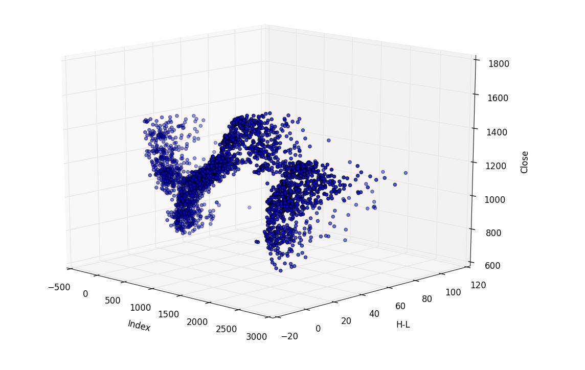
Now, let's get to the good stuff! Let's say we are curious to compare price and H-L together, to see if there's any sort of correlation with H-L and price visually.
threedee = plt.figure().gca(projection='3d')
threedee.scatter(df.index, df['H-L'], df['Close'])
threedee.set_xlabel('Index')
threedee.set_ylabel('H-L')
threedee.set_zlabel('Close')
plt.show()
So, the first new thing you see is we've defined our figure, which is pretty normal, but after plt.figure() we have .gca(projection='3d'). What doe this mean, you ask? Well, Matplotlib just literally displays a window in a typical frame. It is a GUI, and we need to inform it immediately that we are intending to make this plot 3D. What Matplotlib does is quite literally draws your plot on the figure, then displays it when you ask it to. Naturally, if you plan to draw in 3D, it'd be a good idea to let Matplotlib know this!
After that, we do .scatter, only this time we specify 3 plot parameters, x, y, and z.
From there, we're just labeling axis and showing the plot. Even though we didn't have Pandas to hold our hand, not too bad!
Now, comparing H-L to price is somewhat silly, since we could take out the date variable, since it doesn't matter in that comparison. If we took out the date var, well then we've got ourselves a simple 2D plot and didn't need 3D anyway! What about H-L, price, and volume? Sure, let's show that:
threedee = plt.figure().gca(projection='3d')
threedee.scatter(df.index, df['H-L'], df['Volume'])
threedee.set_xlabel('Index')
threedee.set_ylabel('H-L')
threedee.set_zlabel('Volume')
plt.show()
-
Intro to Pandas and Saving to a CSV and reading from a CSV
-
Pandas Column manipulation
-
Pandas Column Operations (basic math operations and moving averages)
-
Pandas 2D Visualization of Pandas data with Matplotlib, including plotting dates
-
Pandas 3D Visualization of Pandas data with Matplotlib
-
Pandas Standard Deviation
-
Pandas Correlation matrix and Statistics Information on Data
-
Pandas Function mapping for advanced Pandas users
