Share X Axis, sharex, with Matplotlib
In this tutorial for data visualization in Matplotlib, we're going to be talking about the sharex option, which allows us to share the x axis between plots. Sharex is maybe better thought of as "duplicate x."
Before we get to that, first we're going to prune and set the max number of ticks on the other axis like so:
ax2.yaxis.set_major_locator(mticker.MaxNLocator(nbins=7, prune='upper'))
and...
ax3.yaxis.set_major_locator(mticker.MaxNLocator(nbins=4, prune='upper'))
Now, let's share the x axis between all of the axis. To do this, we need to add it into the axis definitions:
    fig = plt.figure()
    ax1 = plt.subplot2grid((6,1), (0,0), rowspan=1, colspan=1)
    plt.title(stock)
    plt.ylabel('H-L')
    ax2 = plt.subplot2grid((6,1), (1,0), rowspan=4, colspan=1, sharex=ax1)
    plt.ylabel('Price')
    ax3 = plt.subplot2grid((6,1), (5,0), rowspan=1, colspan=1, sharex=ax1)
    plt.ylabel('MAvgs')
Above, for ax2 and ax3, we add a new parameter, called sharex, and then we're saying we want to share the x with ax1.
With this, we can load the graph, then we can zoom in to a specific point, and the result would be something like:
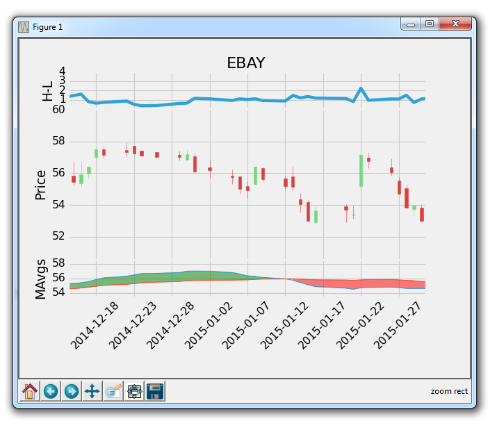
So this means the axis move along their x axis together. Pretty cool!
Next, let's apply the [-start:] to all data, so the axis all start together. This makes our finishing code as:
import matplotlib.pyplot as plt
import matplotlib.dates as mdates
import matplotlib.ticker as mticker
from matplotlib.finance import candlestick_ohlc
from matplotlib import style

import numpy as np
import urllib
import datetime as dt

style.use('fivethirtyeight')
print(plt.style.available)

print(plt.__file__)

MA1 = 10
MA2 = 30

def moving_average(values, window):
    weights = np.repeat(1.0, window)/window
    smas = np.convolve(values, weights, 'valid')
    return smas

def high_minus_low(highs, lows):
    return highs-lows


def bytespdate2num(fmt, encoding='utf-8'):
    strconverter = mdates.strpdate2num(fmt)
    def bytesconverter(b):
        s = b.decode(encoding)
        return strconverter(s)
    return bytesconverter


def graph_data(stock):

    fig = plt.figure()
    ax1 = plt.subplot2grid((6,1), (0,0), rowspan=1, colspan=1)
    plt.title(stock)
    plt.ylabel('H-L')
    ax2 = plt.subplot2grid((6,1), (1,0), rowspan=4, colspan=1, sharex=ax1)
    plt.ylabel('Price')
    ax3 = plt.subplot2grid((6,1), (5,0), rowspan=1, colspan=1, sharex=ax1)
    plt.ylabel('MAvgs')


    stock_price_url = 'http://chartapi.finance.yahoo.com/instrument/1.0/'+stock+'/chartdata;type=quote;range=1y/csv'
    source_code = urllib.request.urlopen(stock_price_url).read().decode()
    stock_data = []
    split_source = source_code.split('\n')
    for line in split_source:
        split_line = line.split(',')
        if len(split_line) == 6:
            if 'values' not in line and 'labels' not in line:
                stock_data.append(line)


    date, closep, highp, lowp, openp, volume = np.loadtxt(stock_data,
                                                          delimiter=',',
                                                          unpack=True,
                                                          converters={0: bytespdate2num('%Y%m%d')})

    x = 0
    y = len(date)
    ohlc = []

    while x < y:
        append_me = date[x], openp[x], highp[x], lowp[x], closep[x], volume[x]
        ohlc.append(append_me)
        x+=1

    ma1 = moving_average(closep,MA1)
    ma2 = moving_average(closep,MA2)
    start = len(date[MA2-1:])

    h_l = list(map(high_minus_low, highp, lowp))


    ax1.plot_date(date[-start:],h_l[-start:],'-')
    ax1.yaxis.set_major_locator(mticker.MaxNLocator(nbins=4, prune='lower'))


    candlestick_ohlc(ax2, ohlc[-start:], width=0.4, colorup='#77d879', colordown='#db3f3f')


    ax2.yaxis.set_major_locator(mticker.MaxNLocator(nbins=7, prune='upper'))
    ax2.grid(True)

    bbox_props = dict(boxstyle='round',fc='w', ec='k',lw=1)

    ax2.annotate(str(closep[-1]), (date[-1], closep[-1]),
                 xytext = (date[-1]+4, closep[-1]), bbox=bbox_props)


##    # Annotation example with arrow
##    ax2.annotate('Bad News!',(date[11],highp[11]),
##                 xytext=(0.8, 0.9), textcoords='axes fraction',
##                 arrowprops = dict(facecolor='grey',color='grey'))
##
##
##    # Font dict example
##    font_dict = {'family':'serif',
##                 'color':'darkred',
##                 'size':15}
##    # Hard coded text
##    ax2.text(date[10], closep[1],'Text Example', fontdict=font_dict)


    ax3.plot(date[-start:], ma1[-start:], linewidth=1)
    ax3.plot(date[-start:], ma2[-start:], linewidth=1)

    ax3.fill_between(date[-start:], ma2[-start:], ma1[-start:],
                     where=(ma1[-start:] < ma2[-start:]),
                     facecolor='r', edgecolor='r', alpha=0.5)

    ax3.fill_between(date[-start:], ma2[-start:], ma1[-start:],
                     where=(ma1[-start:] > ma2[-start:]),
                     facecolor='g', edgecolor='g', alpha=0.5)

    ax3.xaxis.set_major_formatter(mdates.DateFormatter('%Y-%m-%d'))
    ax3.xaxis.set_major_locator(mticker.MaxNLocator(10))
    ax3.yaxis.set_major_locator(mticker.MaxNLocator(nbins=4, prune='upper'))

    for label in ax3.xaxis.get_ticklabels():
        label.set_rotation(45)


    plt.setp(ax1.get_xticklabels(), visible=False)
    plt.setp(ax2.get_xticklabels(), visible=False)
    plt.subplots_adjust(left=0.11, bottom=0.24, right=0.90, top=0.90, wspace=0.2, hspace=0)
    plt.show()


graph_data('EBAY')
Next, we're going to talk about how we can have multiple Y axis.
There exists 1 quiz/question(s) for this tutorial. for access to these, video downloads, and no ads.
-
Introduction to Matplotlib and basic line
-
Legends, Titles, and Labels with Matplotlib
-
Bar Charts and Histograms with Matplotlib
-
Scatter Plots with Matplotlib
-
Stack Plots with Matplotlib
-
Pie Charts with Matplotlib
-
Loading Data from Files for Matplotlib
-
Data from the Internet for Matplotlib
-
Converting date stamps for Matplotlib
-
Basic customization with Matplotlib
-
Unix Time with Matplotlib
-
Colors and Fills with Matplotlib
-
Spines and Horizontal Lines with Matplotlib
-
Candlestick OHLC graphs with Matplotlib
-
Styles with Matplotlib
-
Live Graphs with Matplotlib
-
Annotations and Text with Matplotlib
-
Annotating Last Price Stock Chart with Matplotlib
-
Subplots with Matplotlib
-
Implementing Subplots to our Chart with Matplotlib
-
More indicator data with Matplotlib
-
Custom fills, pruning, and cleaning with Matplotlib
-
Share X Axis, sharex, with Matplotlib
-
Multi Y Axis with twinx Matplotlib
-
Custom Legends with Matplotlib
-
Basemap Geographic Plotting with Matplotlib
-
Basemap Customization with Matplotlib
-
Plotting Coordinates in Basemap with Matplotlib
-
3D graphs with Matplotlib
-
3D Scatter Plot with Matplotlib
-
3D Bar Chart with Matplotlib
-
Conclusion with Matplotlib
