Basic customization with Matplotlib
In this Matplotlib tutorial, we're going to be talking about some of the possible customizations to graphs. In order to start modifying the subplots, we have to define them. We will talk about them soon, but there are two major ways to define subplots, and to structure them. For now, we'll just use one of them, but we will be explaining them shortly.
Now, modifying our graph_data function:
def graph_data(stock):

    fig = plt.figure()
    ax1 = plt.subplot2grid((1,1), (0,0))
In order to modify the figure, we need to reference it, so we'll store it to the variable called fig. Then we define ax1 as a subplot on the figure. We're using subplot2grid here, which is one of two major ways to get subplots. We'll talk more on how these work, but for now, you should see that we have 2 tuples provided with this, (1,1) and (0,0). The 1,1 says this is a 1 x 1 grid. Then 0,0 is us saying the "starting point" for this sub plot will be 0,0.
Next, moving along through the code we've already written to get and parse the data:
    # Unfortunately, Yahoo's API is no longer available
    # feel free to adapt the code to another source, or use this drop-in replacement.
    stock_price_url = 'https://pythonprogramming.net/yahoo_finance_replacement'
    source_code = urllib.request.urlopen(stock_price_url).read().decode()
    stock_data = []
    split_source = source_code.split('\n')
    for line in split_source[1:]:
        split_line = line.split(',')
        if len(split_line) == 7:
            if 'values' not in line and 'labels' not in line:
                stock_data.append(line)

    date, closep, highp, lowp, openp, adj_closep, volume = np.loadtxt(stock_data,
                                                          delimiter=',',
                                                          unpack=True,
                                                          converters={0: bytespdate2num('%Y-%m-%d')})
Then, we can plot data now doing:
ax1.plot_date(date, closep,'-', label='Price')
Now, since we're plotting dates, we might find that the dates are running over each other when horizontal, if we zoom in. We can customize these tick labels, however, like so:
    for label in ax1.xaxis.get_ticklabels():
        label.set_rotation(45)
This will make the labels diagonal. Next, we can add a grid with:
ax1.grid(True)
Then, we leave everything else pretty much, but we may also want to adjust the plot a bit because the dates are running off the graph. Remember the "configure subplots" button we talked about in the first tutorial? Not only can we configure the plots this way, we can also configure them in the code, here's how we can set those parameters:
plt.subplots_adjust(left=0.09, bottom=0.20, right=0.94, top=0.90, wspace=0.2, hspace=0)
Now, just in case we left you behind somewhere, here's the full code:
import matplotlib.pyplot as plt
import numpy as np
import urllib
import matplotlib.dates as mdates

def bytespdate2num(fmt, encoding='utf-8'):
    strconverter = mdates.strpdate2num(fmt)
    def bytesconverter(b):
        s = b.decode(encoding)
        return strconverter(s)
    return bytesconverter


def graph_data(stock):

    fig = plt.figure()
    ax1 = plt.subplot2grid((1,1), (0,0))

    # Unfortunately, Yahoo's API is no longer available
    # feel free to adapt the code to another source, or use this drop-in replacement.
    stock_price_url = 'https://pythonprogramming.net/yahoo_finance_replacement'
    source_code = urllib.request.urlopen(stock_price_url).read().decode()
    stock_data = []
    split_source = source_code.split('\n')
    for line in split_source[1:]:
        split_line = line.split(',')
        if len(split_line) == 7:
            if 'values' not in line and 'labels' not in line:
                stock_data.append(line)

    date, closep, highp, lowp, openp, adj_closep, volume = np.loadtxt(stock_data,
                                                          delimiter=',',
                                                          unpack=True,
                                                          converters={0: bytespdate2num('%Y-%m-%d')})

    ax1.plot_date(date, closep,'-', label='Price')
    for label in ax1.xaxis.get_ticklabels():
        label.set_rotation(45)
    ax1.grid(True)#, color='g', linestyle='-', linewidth=5)

    plt.xlabel('Date')
    plt.ylabel('Price')
    plt.title('Interesting Graph\nCheck it out')
    plt.legend()
    plt.subplots_adjust(left=0.09, bottom=0.20, right=0.94, top=0.90, wspace=0.2, hspace=0)
    plt.show()


graph_data('TSLA')
The result should be:
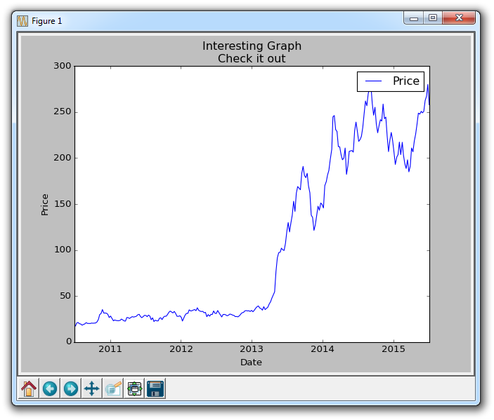
Also note the commented out customization options for the grid in the source code. Just like plotted lines, you can color, change thickness, and linestyle of the grid if you want.
There exists 3 quiz/question(s) for this tutorial. for access to these, video downloads, and no ads.
-
Introduction to Matplotlib and basic line
-
Legends, Titles, and Labels with Matplotlib
-
Bar Charts and Histograms with Matplotlib
-
Scatter Plots with Matplotlib
-
Stack Plots with Matplotlib
-
Pie Charts with Matplotlib
-
Loading Data from Files for Matplotlib
-
Data from the Internet for Matplotlib
-
Converting date stamps for Matplotlib
-
Basic customization with Matplotlib
-
Unix Time with Matplotlib
-
Colors and Fills with Matplotlib
-
Spines and Horizontal Lines with Matplotlib
-
Candlestick OHLC graphs with Matplotlib
-
Styles with Matplotlib
-
Live Graphs with Matplotlib
-
Annotations and Text with Matplotlib
-
Annotating Last Price Stock Chart with Matplotlib
-
Subplots with Matplotlib
-
Implementing Subplots to our Chart with Matplotlib
-
More indicator data with Matplotlib
-
Custom fills, pruning, and cleaning with Matplotlib
-
Share X Axis, sharex, with Matplotlib
-
Multi Y Axis with twinx Matplotlib
-
Custom Legends with Matplotlib
-
Basemap Geographic Plotting with Matplotlib
-
Basemap Customization with Matplotlib
-
Plotting Coordinates in Basemap with Matplotlib
-
3D graphs with Matplotlib
-
3D Scatter Plot with Matplotlib
-
3D Bar Chart with Matplotlib
-
Conclusion with Matplotlib
