Rolling statistics - p.11 Data Analysis with Python and Pandas Tutorial
Welcome to another data analysis with Python and Pandas tutorial series, where we become real estate moguls. In this tutorial, we're going to be covering the application of various rolling statistics to our data in our dataframes.
One of the more popular rolling statistics is the moving average. This takes a moving window of time, and calculates the average or the mean of that time period as the current value. In our case, we have monthly data. So a 10 moving average would be the current value, plus the previous 9 months of data, averaged, and there we would have a 10 moving average of our monthly data. Doing this is Pandas is incredibly fast. Pandas comes with a few pre-made rolling statistical functions, but also has one called a rolling_apply. This allows us to write our own function that accepts window data and apply any bit of logic we want that is reasonable. This means that even if Pandas doesn't officially have a function to handle what you want, they have you covered and allow you to write exactly what you need. Let's start with a basic moving average, or a rolling_mean as Pandas calls it. You can check out all of the Moving/Rolling statistics from Pandas' documentation.
Our starting script, which was covered in the previous tutorials, looks like this:
import Quandl
import pandas as pd
import pickle
import matplotlib.pyplot as plt
from matplotlib import style
style.use('fivethirtyeight')

# Not necessary, I just do this so I do not show my API key.
api_key = open('quandlapikey.txt','r').read()

def state_list():
    fiddy_states = pd.read_html('https://simple.wikipedia.org/wiki/List_of_U.S._states')
    return fiddy_states[0][0][1:]


def grab_initial_state_data():
    states = state_list()

    main_df = pd.DataFrame()

    for abbv in states:
        query = "FMAC/HPI_"+str(abbv)
        df = Quandl.get(query, authtoken=api_key)
        print(query)
        df[abbv] = (df[abbv]-df[abbv][0]) / df[abbv][0] * 100.0
        print(df.head())
        if main_df.empty:
            main_df = df
        else:
            main_df = main_df.join(df)

    pickle_out = open('fiddy_states3.pickle','wb')
    pickle.dump(main_df, pickle_out)
    pickle_out.close()

def HPI_Benchmark():
    df = Quandl.get("FMAC/HPI_USA", authtoken=api_key)
    df["United States"] = (df["United States"]-df["United States"][0]) / df["United States"][0] * 100.0
    return df

fig = plt.figure()
ax1 = plt.subplot2grid((1,1), (0,0))
HPI_data = pd.read_pickle('fiddy_states3.pickle')
plt.show()
Now, we can add some new data, after we define HPI_data like so:
HPI_data['TX12MA'] = pd.rolling_mean(HPI_data['TX'], 12)
This gives us a new column, which we've named TX12MA to reflect Texas, and 12 moving average. We apply this with pd.rolling_mean(), which takes 2 main parameters, the data we're applying this to, and the periods/windows that we're doing.
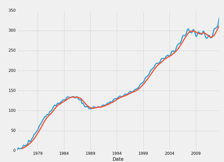
With rolling statistics, NaN data will be generated initially. Consider doing a 10 moving average. On row #3, we simply do not have 10 prior data points. Thus, NaN data will form. You can either just leave it there, or remove it with a dropna(), covered in the previous tutorial.
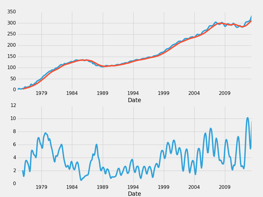
Another interesting one is rolling standard deviation. We'd need to put that on its own graph, but we can do that:
fig = plt.figure()
ax1 = plt.subplot2grid((2,1), (0,0))
ax2 = plt.subplot2grid((2,1), (1,0), sharex=ax1)
HPI_data = pd.read_pickle('fiddy_states3.pickle')
HPI_data['TX12MA'] = pd.rolling_mean(HPI_data['TX'], 12)
HPI_data['TX12STD'] = pd.rolling_std(HPI_data['TX'], 12)

HPI_data['TX'].plot(ax=ax1)
HPI_data['TX12MA'].plot(ax=ax1)
HPI_data['TX12STD'].plot(ax=ax2)

plt.show()
A few things happened here, let's talk about them real quick.
ax1 = plt.subplot2grid((2,1), (0,0))
ax2 = plt.subplot2grid((2,1), (1,0), sharex=ax1)
Here, we defined a 2nd axis, as well as changing our size. We said this grid for subplots is a 2 x 1 (2 tall, 1 wide), then we said ax1 starts at 0,0 and ax2 starts at 1,0, and it shares the x axis with ax1. This allows us to zoom in on one graph and the other zooms in to the same point. Confused still about Matplotlib? Check out the full Data Visualization with Matplotlib tutorial series.
Next, we calculated the moving standard deviation:
HPI_data['TX12STD'] = pd.rolling_std(HPI_data['TX'], 12)
Then we graphed everything.
Another interesting visualization would be to compare the Texas HPI to the overall HPI. Then do a rolling correlation between the two of them. The assumption would be that when correlation was falling, there would soon be a reversion. If correlation was falling, that'd mean the Texas HPI and the overall HPI were diverging. Let's say the overall US HPI was on top and TX_HPI was diverging below. In this case, we may choose to invest in TX real-estate. Another option would be to use TX and another area that has high correlation with it. Texas, for example had a 0.983235 correlation with Alaska. Let's see how our plan would look visually. The ending block should now look like:
fig = plt.figure()
ax1 = plt.subplot2grid((2,1), (0,0))
ax2 = plt.subplot2grid((2,1), (1,0), sharex=ax1)
HPI_data = pd.read_pickle('fiddy_states3.pickle')

TX_AK_12corr = pd.rolling_corr(HPI_data['TX'], HPI_data['AK'], 12)

HPI_data['TX'].plot(ax=ax1, label="TX HPI")
HPI_data['AK'].plot(ax=ax1, label="AK HPI")
ax1.legend(loc=4)

TX_AK_12corr.plot(ax=ax2)

plt.show()
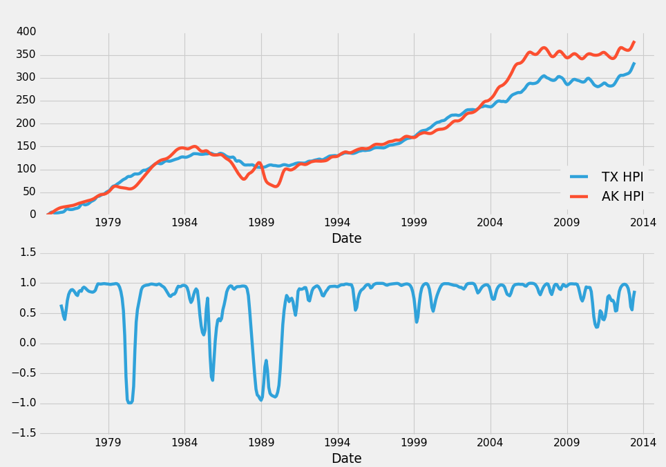
Every time correlation drops, you should in theory sell property in the are that is rising, and then you should buy property in the area that is falling. The idea is that, these two areas are so highly correlated that we can be very confident that the correlation will eventually return back to about 0.98. As such, when correlation is -0.5, we can be very confident in our decision to make this move, as the outcome can be one of the following: HPI forever diverges like this and never returns (unlikely), the falling area rises up to meet the rising one, in which case we win, the rising area falls to meet the other falling one, in which case we made a great sale, or both move to re-converge, in which case we definitely won out. It's unlikely with HPI that these markets will fully diverge permanantly. We can see clearly that this just simply doesnt happen, and we've got 40 years of data to back that up.
In the next tutorial, we're going to talk about detecting outliers, both erroneous and not, and include some of the philsophy behind how to handle such data.
-
Data Analysis with Python and Pandas Tutorial Introduction
-
Pandas Basics - p.2 Data Analysis with Python and Pandas Tutorial
-
IO Basics - p.3 Data Analysis with Python and Pandas Tutorial
-
Building dataset - p.4 Data Analysis with Python and Pandas Tutorial
-
Concatenating and Appending dataframes - p.5 Data Analysis with Python and Pandas Tutorial
-
Joining and Merging Dataframes - p.6 Data Analysis with Python and Pandas Tutorial
-
Pickling - p.7 Data Analysis with Python and Pandas Tutorial
-
Percent Change and Correlation Tables - p.8 Data Analysis with Python and Pandas Tutorial
-
Resampling - p.9 Data Analysis with Python and Pandas Tutorial
-
Handling Missing Data - p.10 Data Analysis with Python and Pandas Tutorial
-
Rolling statistics - p.11 Data Analysis with Python and Pandas Tutorial
-
Applying Comparison Operators to DataFrame - p.12 Data Analysis with Python and Pandas Tutorial
-
Joining 30 year mortgage rate - p.13 Data Analysis with Python and Pandas Tutorial
-
Adding other economic indicators - p.14 Data Analysis with Python and Pandas Tutorial
-
Rolling Apply and Mapping Functions - p.15 Data Analysis with Python and Pandas Tutorial
-
Scikit Learn Incorporation - p.16 Data Analysis with Python and Pandas Tutorial
